From employee #1 to design lead at a
$4 billion 🦄
ROLES
Founding Designer
PERIOD
Oct 2012 - Sep 2016
Collaborated with
Engineering, Product, Growth, Support

Between 2012 and 2016, I was the #1st employee and Lead Designer at BrowserStack and experienced first hand the decisions needed to build a tiny, bootstrapped startup into a $4 billion unicorn.
As employee #1, I reported directly to CEO Ritesh Arora, partnering on product strategy, design direction, and team building.
⭐ The Opportunity
The infrastructure to properly test websites and apps across browsers and devices is complicated and costly to setup. By offering testing within a browser, BrowserStack removed the setup and reduced high costs of maintaining their own devices.
🚢 Accomplishments
Designed and shipped 3 new products - Screenshots, Responsive and Automate, redesigned the flagship Live product, led the redesign of the brand to reflect the shift to enterprise, and led, hired and grew the design, front-end and content teams.
🚀 Outcomes
Increased user subscriptions for the Live product by over 200% and grew the design team from 0 to 12. The brand redesign gave large ticket enterprise leads like BBC, RBS, Github and Discovery the confidence to sign up.
why browserstack won.
🚩 The problem
Between 2012 - 2016, the biggest pain points of testing websites across browsers and devices were:
You needed to install all browsers locally or in a VM. VMs were heavy, complicated to setup and drain system resources affecting performance of the machine.
Procuring licenced copies of each OS was costly.
The particular pain point was testing and fixing websites for IE8 which was the default browser in many Windows machines.
Enterprises incurred huge costs involved with procuring, purchasing, shipping, operating and maintaining racks of real devices in order to test their applications.
✅ How BrowserStack solved it
Allowed users to perform cross browser testing by connecting to VMs through their browser.
No complex setups, just click to start.
This drastically reduced costs for users as they only had to pay for a subscription and no extra software or hardware.
Simple UX that made it easy for users to choose their OS+browser combination and get started in 3 clicks.
💆🏽♂️ Challenges
High latency made the system unusable.
Remote machines would die with no explanation provided to the user. No user feedback meant that users would just stare at the screen waiting for something to happen.
Complicated setup for testing local files and development servers. Could only reliably test production/live websites.
Expected behavior like copy/pasting or uploading files would not work.
System used Java and Adobe Flash to render the remote browser. However, this did not support streaming media.
Unsupported browsers like Opera and Yandex.
Design decisions that led to success.
Deliver a near native testing experience in the cloud by reducing network latency and supporting native OS/browser functionality.
🚩 The problem
Latency depended on the strength of the users connection.
Existing Flash technology did not support streaming audio and video.
Testing local and development environments required installing a Java app, which many users and companies did not want to do.
Basic OS and browser functionality was not supported - copy/paste did not work; users could not test uploads or downloads, could not update basic OS settings to test impact on browsing experience.
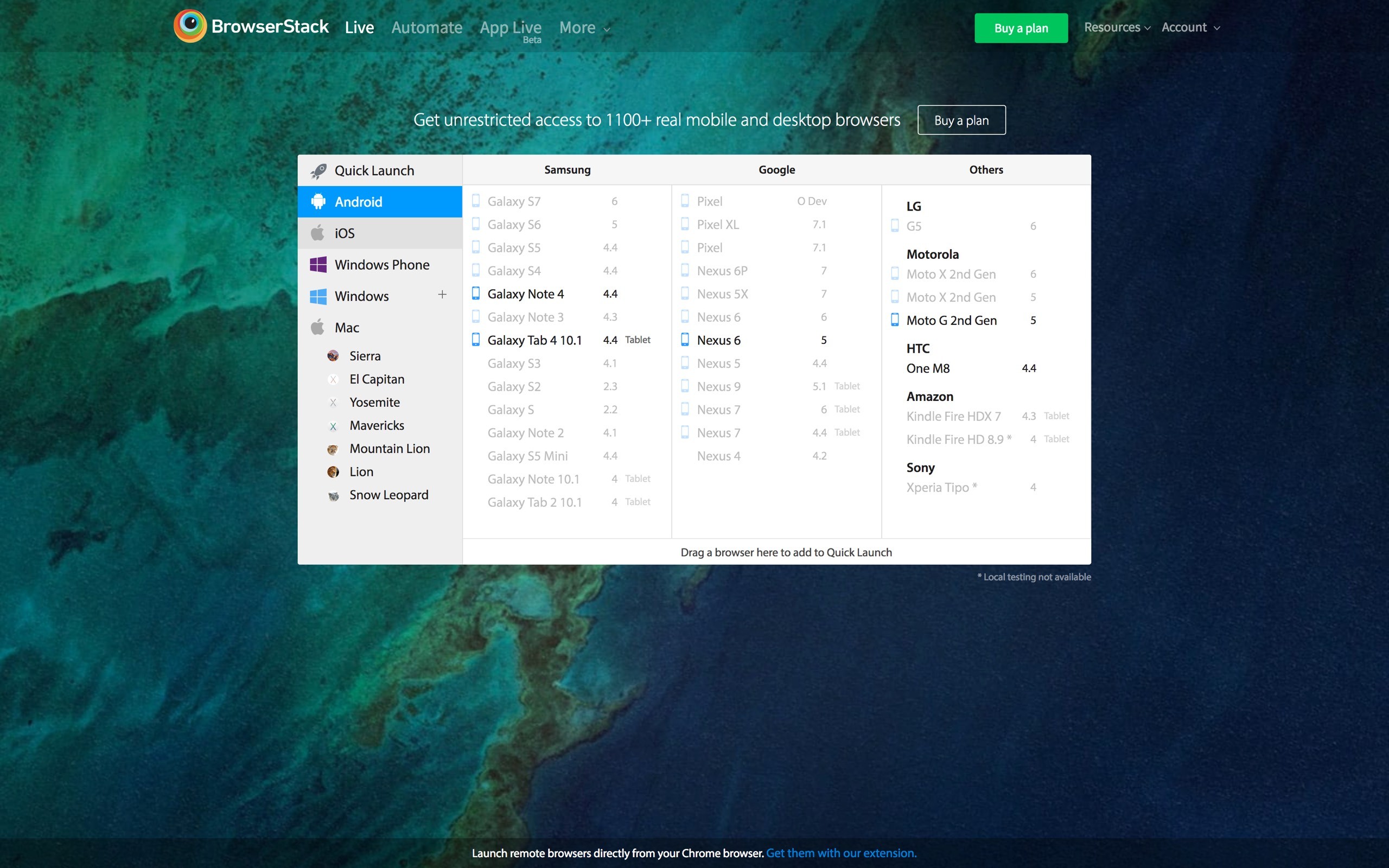
Users had a hard time searching for the exact OS and browser combination they were looking for.
✅ The solution
Reduce latency to less than 5 seconds by replacing Flash with WebRTC and HTML5 Canvas. Since majority of our users were using Firefox and Chrome, we took a call to provide the WebRTC experience on supported browsers, while users from other browsers would get the older Flash and Java based experience.
Users could directly interact and modify the remote browser making it feel more native.
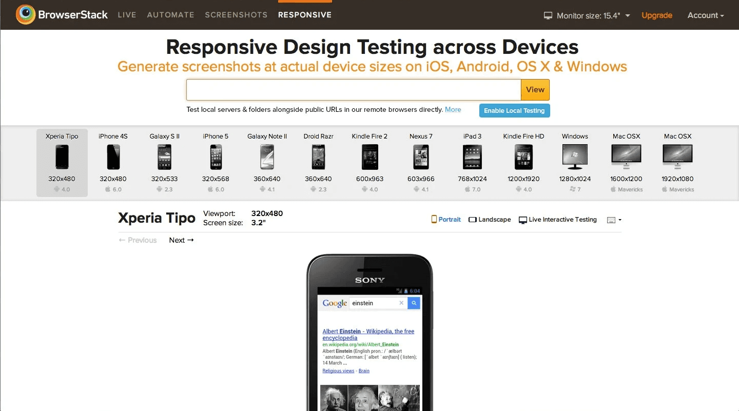
When the user resizes their browser, the remote browser is also resized and switches to the responsive layout if available. This allows users to test real time responsiveness of their websites. This feature made the Responsive product redundant.
Wallpapers help us identify an OS. After matching the default OS wallpapers with the selected OS in the browser listing window, I noticed that the background OS wallpaper of the browser listing gave a perceived speed improvement in the overall experience.

I quickly prototyped the idea and had it validated with a user group. 70% of the users felt a sense of continuity in the testing experience as the matching wallpapers of the browser list and the remote OS merged. They felt the overall experience was faster.
🚀 The impact
2X
user registrations
over 3 months
80-200%
increase in sales OF Freelance, Team and Enterprise plans
Developers should be able to easily connect to and test local and development servers prior to shipping changes, when it's most important.
🚩 The problem
Testing local and development environments required installing a Java app, which many users and companies did not want to do.
✅ The solution
We built Chrome and Firefox extensions that created a secure connection between the user's computer and BrowserStack’s remote browsers. We moved the installation of the extension into the onboarding experience, to explain what it did and how it worked. If users opted-out, they could enable the extension at a later time from the toolbar.


Different states of the new local testing extension
Users could type local URLs like localhost:9000/ directly into the URL bar of the remote browser, making the experience feel very familiar.
🚀 The impact
Users were comfortable with installing a browser extension as the security risk was low and it was a one-time setup.
Reduced sales and support friction significantly as the new solution was much simpler to explain, leading to more conversions.
Opened conversations with enterprise customers who needed SSH and LDAP support.
Rebranding the visual language to signify the shift from scrappy startup to enterprise-grade tool.
🚩 The problem
The existing visual communication screamed startup. Each product had a different visual style along with it's own color palette. This created a disjointed experience for multi-product users.
There was no style guide and engineers relied on a rough color palette chosen from the logo leading to bloat in the CSS and codebase.
Lack of cohesion in the visual communication reduced customer trust leading to lost enterprise deals.


Wildly different visual styles for Live Testing, Screenshots and Responsive reduced enterprise confidence in the product suite.
✅ The solution
Designed a style guide, rooted in strong design fundamentals - typography based on a type scale, a fixed set of colors and layouts based on a 12-column grid with responsiveness baked in.
Worked with the content team to create a vocabulary dictionary as a reference for all teams to ensure communication in a consistent voice and tone.
Created a component library using concepts from Brad Frost's Atomic Design. We used this library to rapidly prototype new ideas.
Assigned two members of the front-end team to be custodians of the style guide, responsible for ensuring changes are only made if teams prove existing components are not enough.
Designed templates for landing and features pages to guide users from awareness → discovery → evaluation.
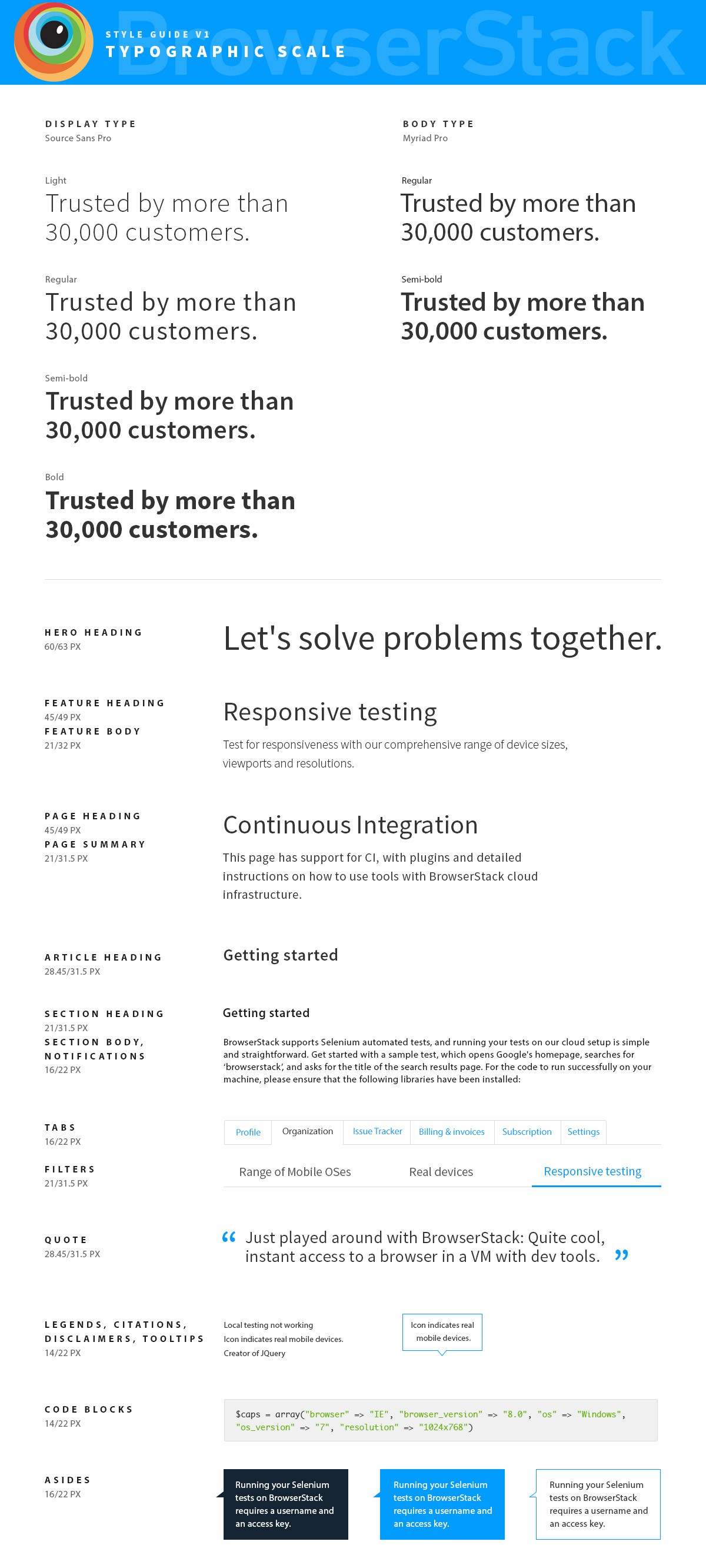


Style guide for the rebanrd
Pricing: Before Redesign

Pricing: After Redesign

We designed new Landing pages using the new style guide to increase feature discovery and focus on the shift to mobile testing.
Mobile Emulators

Remote dEVICE lAB

🚀 The impact
All products followed a single visual style, adding consistency, coherence and predictability in the system. Elements of this are still visible in the current designs, 10 years later.
Since the redesign, BrowserStack were able to close large enterprise deals including BBC, RBS, Wikipedia and more who felt more confidence in dealing with a more mature, confident enterprise-centric team.
Product and design teams were able to prototype, validate and ship ideas faster.
Optimize the checkout process to increase conversions and reduce abandonment.
🚩 The problem
Developers only tested before launch and did not see value in paying for monthly or annual plans, since they would only use it 2-3 times a year.
Existing pricing page did not communicate features well enough.
Adding more products complicated the process of choosing a product.
Enterprise teams wanted to talk to sales team directly and did not want to go through checkout. There was no sales number available however.
Companies wanted to know which other brands were using our services.
Integration and payment issues with 2checkout.
Complicated upgrade, downgrade and proration logic.
Purchase a single licence and share it amongst the team.
Users created multiple spam accounts to use the 30 minute free trial which was enough for their testing requirements.

2012 - 2013: Initial designs for the pricing and upgrade screens by @sazzy


2013 - 2014: A single-page checkout experience in order to expedite the user checkout process.
✅ The solution
Reduce pricing choice confusion by reducing the number of plans.
Allow users to contact us to extend their Free Trial by 14-30 days. This shows intent and allows the team to have a longer discussion around sales.
Display a sales phone number prominently so that enterprise users can call sales teams directly.
Display prominent brand logos on the checkout page to increase customer confidence.
Add FAQs and product features to the checkout page to answer any lingering questions that users may have, particularly around local testing and security.
Assign technical, support staff as dedicated support for large ticket customers as their single point of contact.

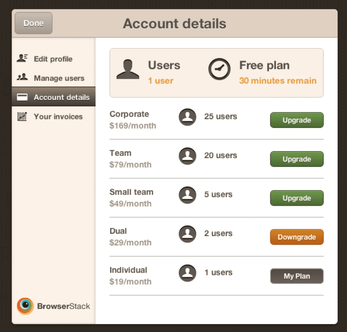
2014-2015: Updated multi-product/multi-plan pricing UI along with design decisions.

2016 onwards: Final design of the pricing page before I left that aligned with the new branding redesign. The redesign also replaced multi-product and multi-plan choices with three simple plans, with an option to choose the number of user licences required
🚀 The impact
Customer confidence increased and we closed larger brands like BBC, Wikipedia.
Replaced 2checkout with Stripe. Customers were more comfortable knowing our payments were processed with Stripe.
From First designer to design lead.
2012 - 2014
Product Designer and Front-end engineer
Designed all products and wrote the corresponding front-end code. Wrote all the micro-copy, content and documentation.

💆🏽♂️ Challenges
This was my first real product-startup experience. Getting used to the fast pace and long hours was challenging initially.
Constantly switching context to meet shipping velocity.
Accepting that functional designs >> polished designs. It felt like my best work was not being valued but soon understood the importance of shipping velocity over polished UI.
🎓 Learnings
Deep understanding of engineering concepts and how the product works, that I would eventually pass on to the design team.
Working in ambiguity and how to convert a product brief or suggestion into a tangible working prototype.
Timeboxing and the importance of moving forward.
2014 - 2015
Senior Product Designer
Hired first visual designer and engaged with a product design consultant to guide the redesign of the flagship product. Hired first technical content writer. Hired first 2 front end devs dedicated to the design team.
💆🏽♂️ Challenges
Finding technical content writers in the SaaS space. Most technical content writers at the time worked for physical product companies that required technical content in user guides and brochures.
Educating engineers about design and vice versa and aligning teams when compromises were required.
Debating candidate hires with the CEO required taking a stand for a candidate and needing the candidate to come through.
Delegating tasks to new hires that needed to be presented to Ritesh directly.
🎓 Learnings
A senior designer can develop tunnel vision. New hires help look at existing problems from a fresh perspective.
Assign tasks to team members based on skill level and real work, not experience and verbal communication.
Trusting your team means accepting that sometimes things go wrong and that is okay.
2015 - 2016
Design Lead
Hired a full-time product designer who today leads design strategy for accessibility across BrowserStack, in addition to two design interns that worked with us for 4 months during the brand redesign.
💆🏽♂️ Challenges
Managing interns during a hectic brand redesign meant entrusting them with simple but pivotal workflows around onboarding and bug fixes. This required a lot of hand holding for the first 2 months.
Communicating with team leaders across different functions - engineering, product, growth, sales and support - in order to design a consistent voice, tone and style guide across communication touchpoints.
🎓 Learnings
Hire multi-disciplinary designers with skills that complement the team.
Take a chance on hires that DON'T come from big brands. They are hungry and looking for an opportunity to prove that they belong.
Bad attitudes affect the morale and performance of the team.
How i shaped design culture
1
Involved engineering teams into design sessions for early feedback and critiques, teaching teams about design processes and design psychology.
2
Conducted "open question" sessions for engineers and designers to learn about processes and workflows of each team.

3
Created a vocabulary dictionary for all teams to use when communicating internally or with customers.
4
Created voice & tone, content and documentation guidelines to ensure written and verbal consistency across all customer facing touch points.
5
Introduced product managers, engineers and designers to design literature like Steve Krug's Don't Make Me Think, Douglas Norman's Design of Everyday Things and Scott McCloud's Understanding Comics to increase their appreciation of design.
👍🏽 What i did right
Stuck with my design instincts even if that meant butting heads with the founders, particularly when debating new hires.
Let go of the wrong team members at the right time. Toxic habits and tardy work was affecting the quality of the team.
Helped the design team establish a high bar for quality - much of the design guidelines I established are still in use today, 10 years on.
👎🏽 what i did wrong
Let senior designers leave at the wrong time, during the high stress of the rebranding project. This added more pressure on the existing team causing friction between engineering and design teams.
Played the hedgehog more often than the fox.
Learnings
Document everything - Good, bad and ugly.
The decisions that a founding team member makes sets the tone for future designers coming into the company. Document all meeting notes, guidelines and design assets in a centralised location for team members to understand the reasoning behind design decisions. Have weekly meetings to ensure that everyone is aware of changes and updates to the design dictionary.
Design relatable experiences grounded in real world workflows.
By modeling the new user experience around that of a virtual machine, we were able to design an experience that users felt familiar with, even though many of them were first time users. Since users could port over their knowledge of using VMs, they found it easier to use BrowserStack without having to change their existing workflows of testing.
I've written in more detail about what I learned at BrowserStack on LinkedIn - https://www.linkedin.com/pulse/10-things-i-learned-browserstacks-lead-designer-first-sagar-patil/
How My time here has helped with building ASIRA.
balancing user requirements versus business needs
Identify which user requests align with business metrics and work on those that lead to more closed leads. Ensure users are never stuck or prevented from doing their job.
fanatical customer support
BrowserStack ensured they listened to customers across all possible touch points. At ASIRA, we use whatsapp to allow users to reach out to us and ensure we respond within 10-15 minutes. This maintains engagement velocity and makes us appear more professional.
great is the enemy of shipped.
As Design Lead, my focus was on well-crafted, highly polished interfaces that were not just good, but great. Now, as a founder, I understand better the importance of shipping quickly and often and not having an expectation of "perfect" or "done".
Acknowledgements
A huge thanks to Ritesh and Nakul for taking a chance on me. It's not everyday you get to shape design direction at a $4 billion unicorn.
A big thanks to all the designers and developers that I worked with over the course of 4 years.
VISIT BROWSERSTACK
Frankensteined in Mumbai.
Fueled by YouTube, 90s cartoons & Heavy Metal.