Redesign the uX of AML and compliance tools for fintech teams.
ROLE
Principal Product Designer
PERIOD
May - October, 2022

Flagright is a YC backed AML (anti money laundering) fintech startup that helps other fintechs ship their compliance infrastructure in 2-4 weeks compared to months or years traditionally.
I joined Flagright in May 2022 as their Principal Product Designer and worked closely with CEO Baran Ozkan and CTO Madhu Nadig to redesign the Transaction Monitoring and Case Management products to improve the user experience for compliance teams.
The Problem.
1-25 Mn Daily
Transactions handled by large popular digital financial platforms like Stripe.
100 - 5000 / sec
Number of transactions carried out on Neobanks like Ziina and GoTyme.
All THESE MILLIONS OF transactions need to be VETTED FOR LEGITIMACY. Companies are required by law to to flag, suspend and report suspicious activity.

Setting up compliance systems is costly and time-consuming and involves completing tedious and lengthy paperwork, registering with local financial regulatory bodies, waiting for approvals and hiring a compliance team.
All this usually takes months or years, depending on the territory. Costs typically run into the hundreds of thousands for software licences, hiring teams, office overheads, etc.
Average annual cost for traditional compliance software.
Annual spend to set up and maintain compliance tools and teams.
50%-75% false positives 👎
Genuine transactions get blocked often creating a poor customer experience.
How Flagright solves this.
Flagright provides a real-time transaction monitoring API that monitors all transactions taking place on a platform and automatically flags or suspends suspicious transactions. They also reduce false positives by using a combination of transaction monitoring and user risk profiling.
5-10
days
to go live
93%
Fewer
false positives
< 700 ms p90
API latency
Where Flagright needed help.
AFTER going live, compliance teams use Flagright's web console to monitor transactions on their platform and take action on suspicious activity. For this, they need tools to manage rules, risk and cases.
I worked with the team to understand the pain points of the existing UX for Beacon and Pulse, explored concepts for new tools, workflows and improvements, designed a component library and spoke with customers to learn about how they would like to use the web console.
Transaction monitoring
beacon
API based rules engine
to detect suspicious
activity within milliseconds
Dynamic Risk profiling
Pulse
Dynamic Risk Scoring to automate risk profiling with customizable algorithms based on user profile & behavior

The team was already using the Ant Design framework when I joined, so I had a base to start with. I used existing components for prototypes and when the visual language was ready, I made interface and visual updates.
Refining the UX of BEACON
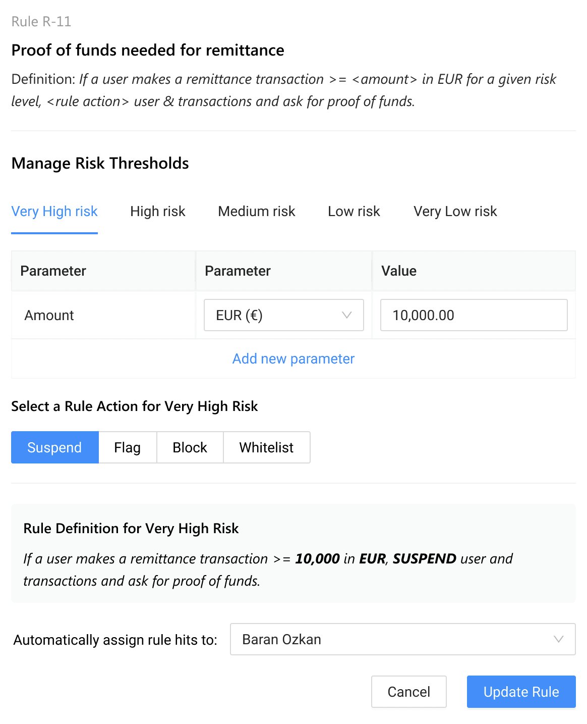
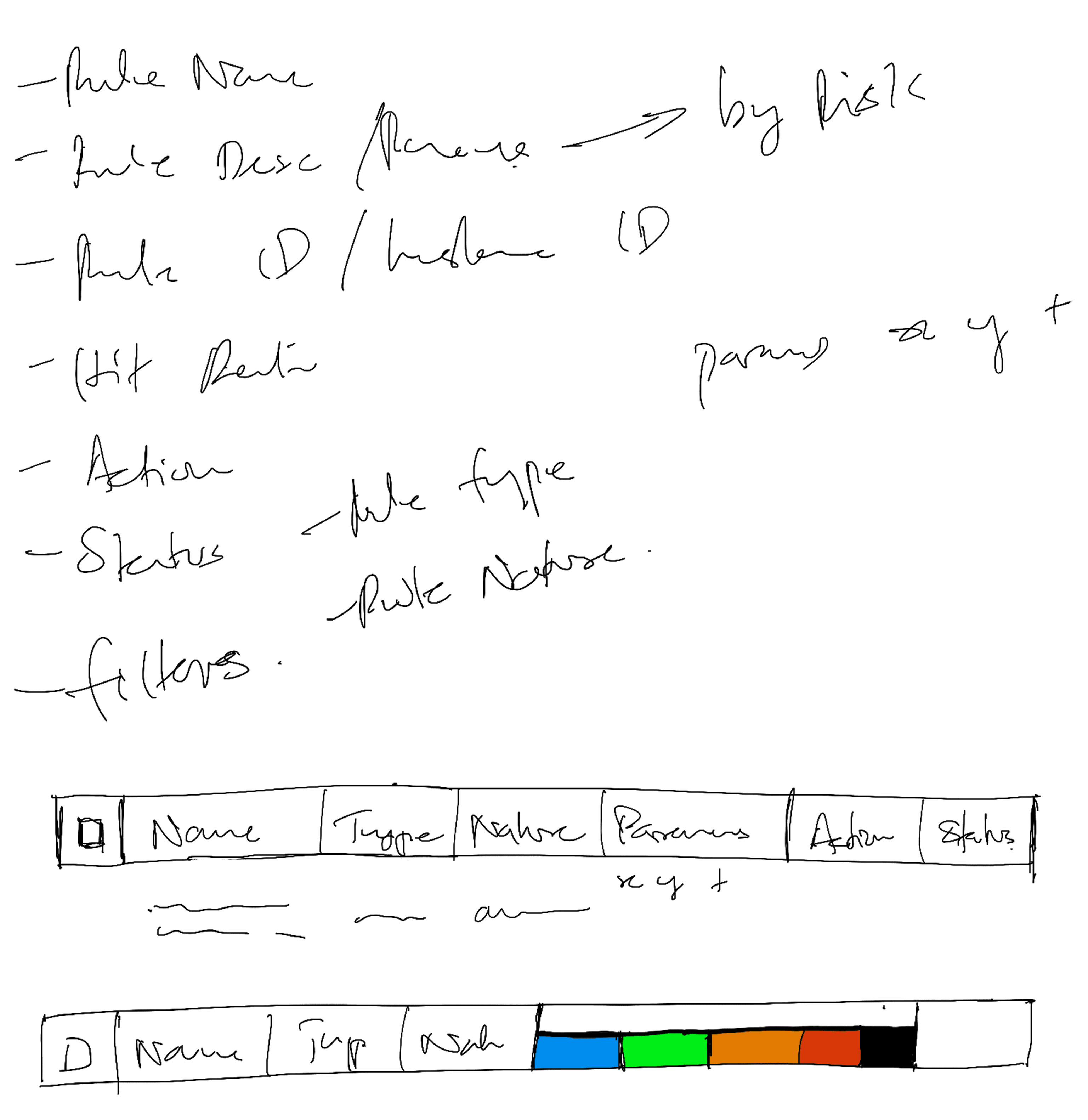
What are Rules?
Rules allow teams to automatically take action on transactions when certain transaction parameters cross pre-defined thresholds at different risk levels. These rules are applied per transaction.
Rules can be applied on both, transactions and users (senders and receivers).
Rules are often grouped together into a Rule Library.
First transaction
First transaction amount on new payment method is greater than (x)
Isolated crypto user
A user makes >= (x) crypto transactions without any fiat transactions.
Transaction amount too high
Transactions amount is USD (x) higher than the expected USD (y)
High volume sender
(x) number of transactions from the same sender in (y) seconds.
Defining a Palette to denote risk
I explored different color palettes to express risk. The most important characteristic of the color palette was to be easily identifibale at a glance, as users scroll through large lists of transactions.

manage RuleS Library
The rules library allows teams to use existing rules or create new rules against which each transaction passing through their system is compared in order to identify suspicious transactions.
Original design for the Rule Library table using the default ANT Design component system

I designed a tabbed panel which allowed users to view Rule actions for different thresholds


Design explorations for how to show risk levels in a table
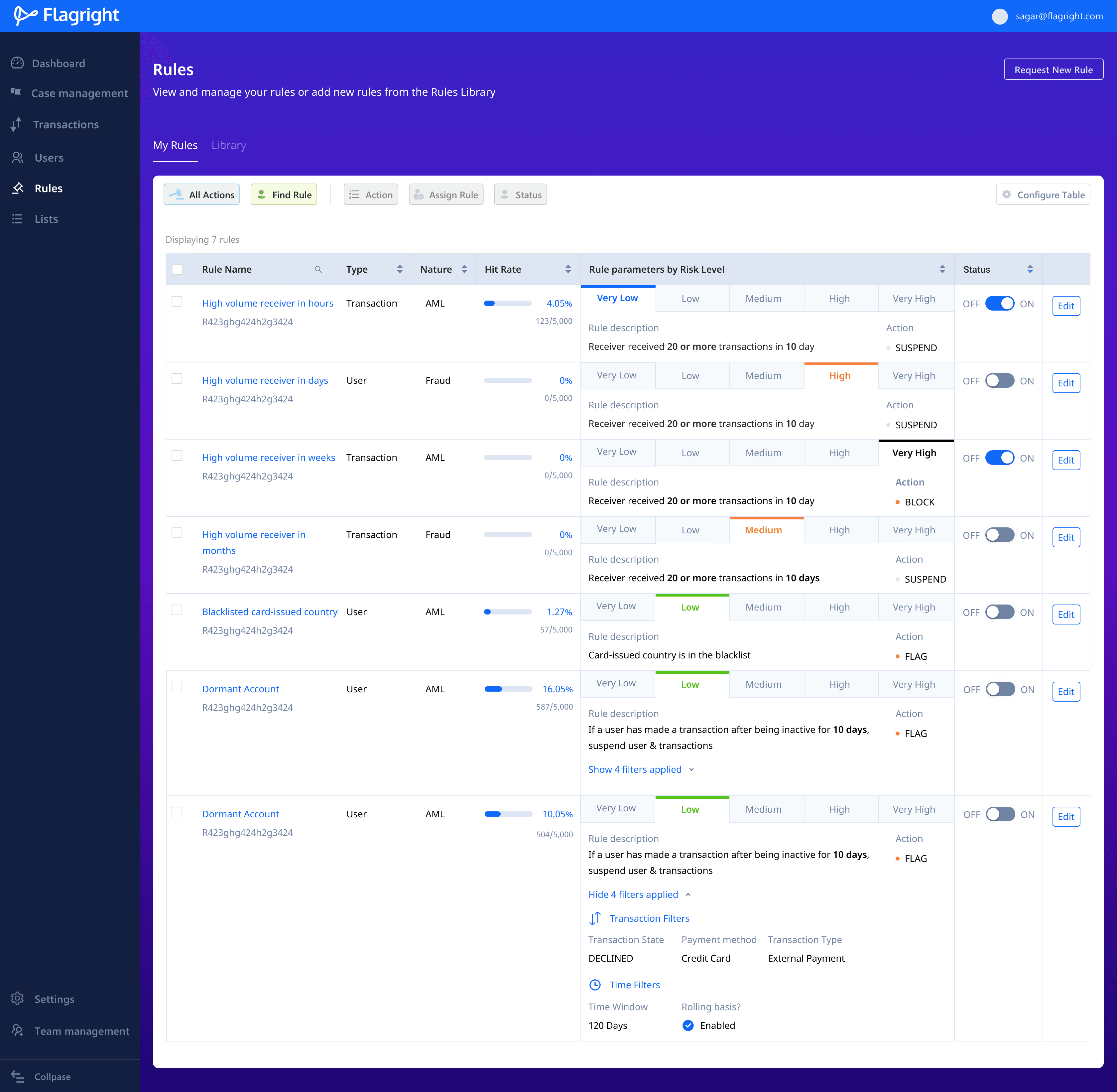
Redesigned Rule Library that displays the name of the rule, description, and how the rule behaves for different risk levels. Public Rules and Private Rules are separated using tabs.
Add rules to the rule library
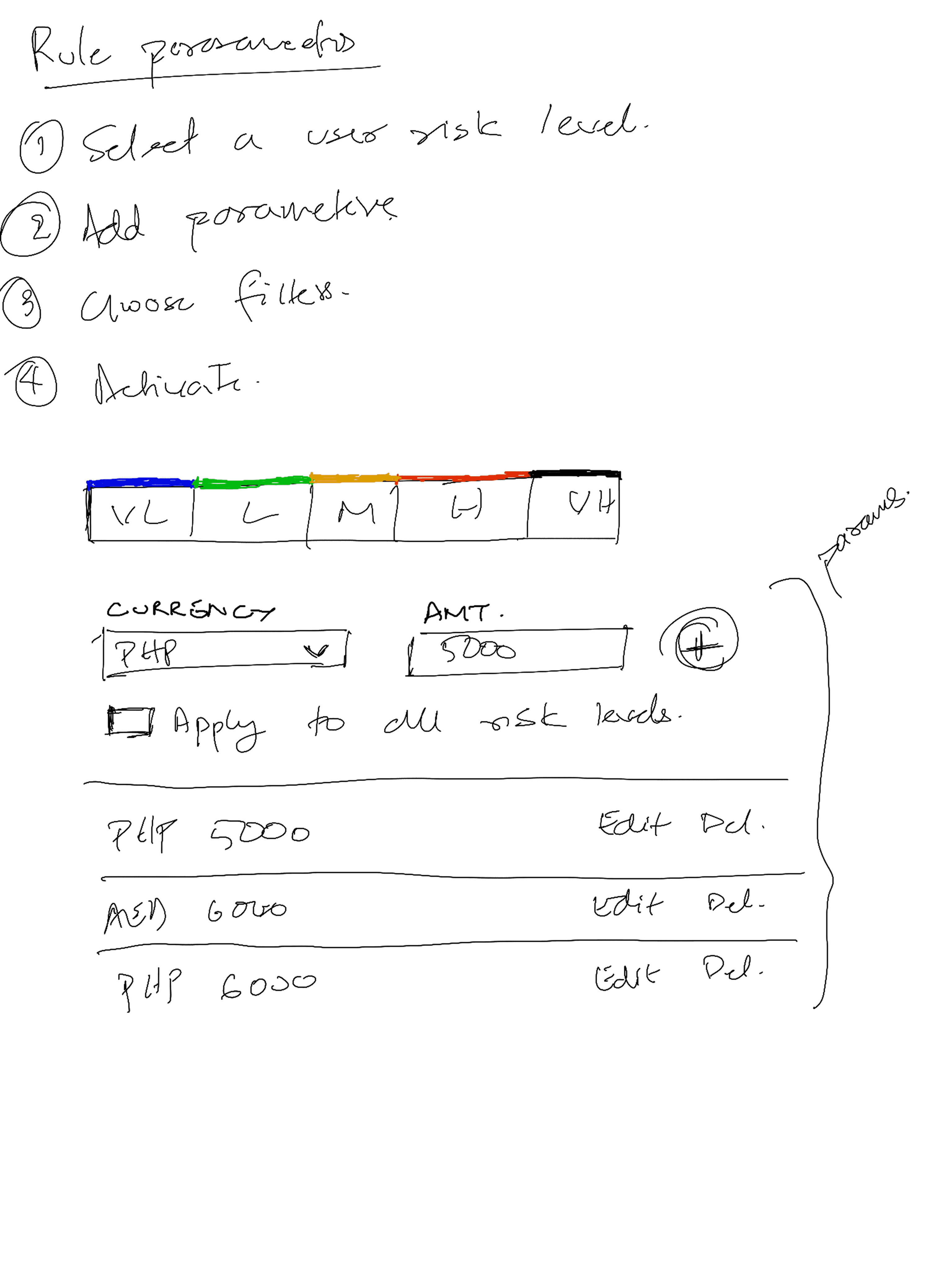
If the existing rules in the Rule Library are not enough, teams can create rules of their own, by extending existing rules or defining new rules.
Users need to describe rule properties, parameters, filters (optional) and the action to take when creating a new rule.

create rules with machine learning
Machine learning allows teams to automatically create transaction and user cases. Users set a confidence score threshold. If the score assigned to a transaction crosses the set threshold, a transaction or user case is automatically created.
To preview the impact of changing the confidence score, I added a Prediction section that provides a percentage approximation of the number of cases that would be created from all transactions.
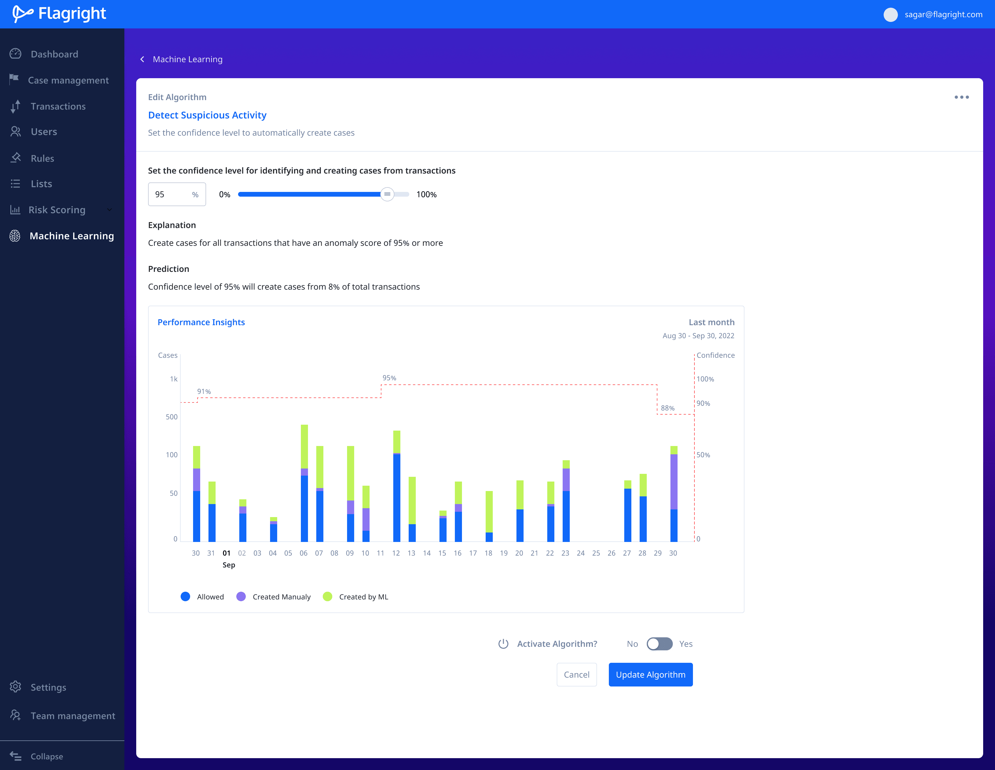
I added Explanation and Prediction sections to explain how the number of cases created corresponds directly to the change in the confidence score.

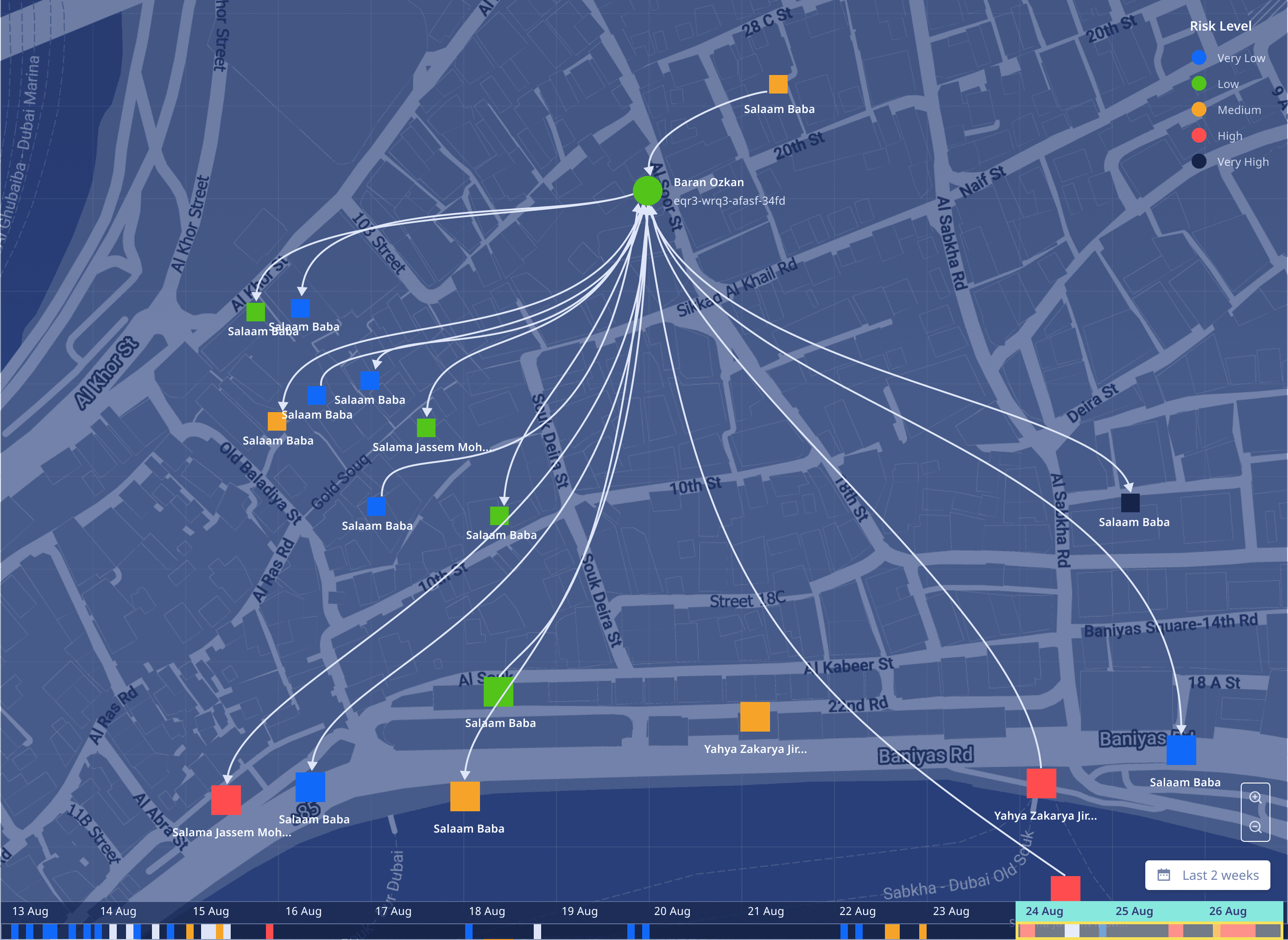
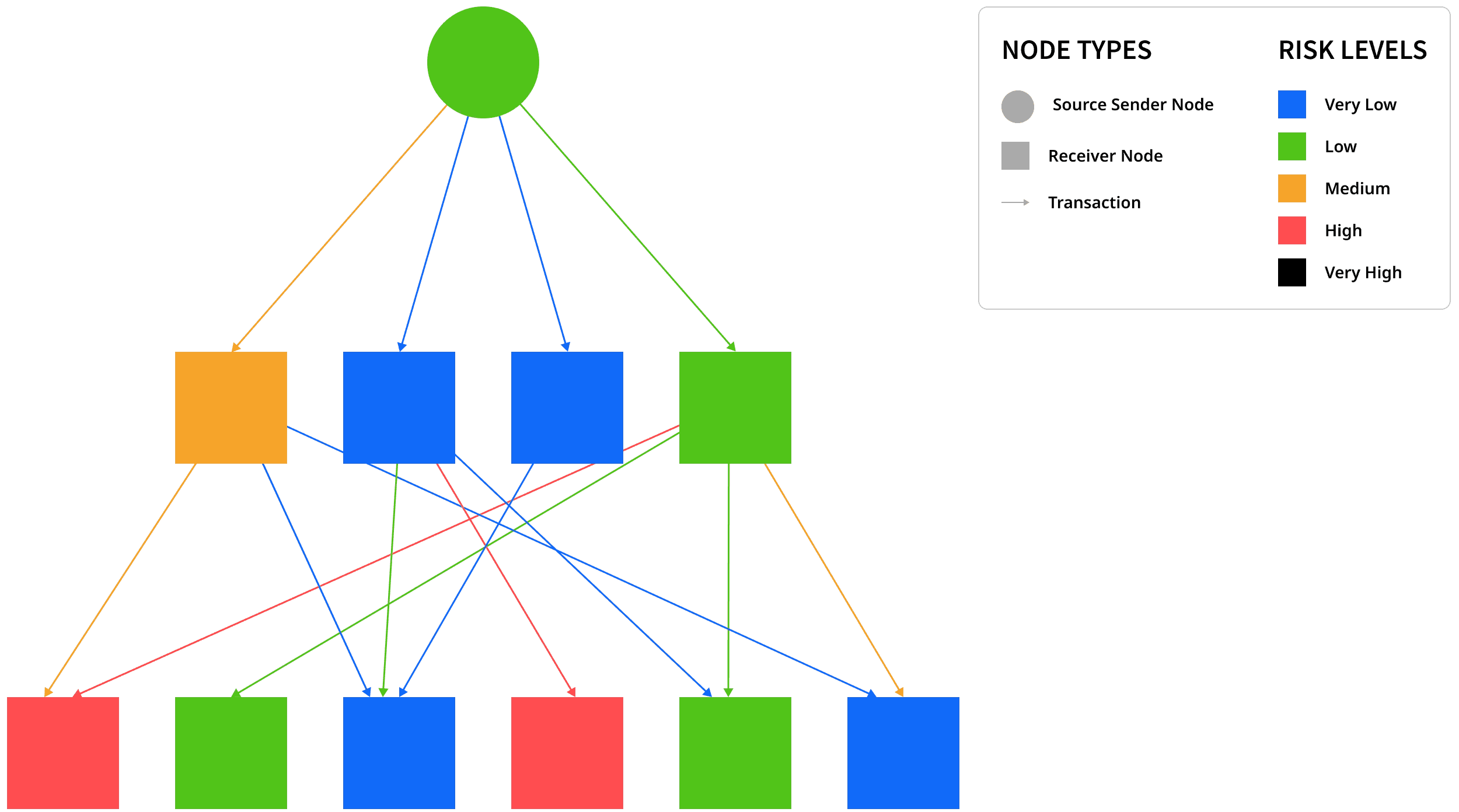
Spiderview
The product team wanted to build a tool that would allow users to visualise the flow of transactions between people across geographies allowing teams to follow suspicious transactions end-to-end and monitor all the senders and receivers involved.
This allows teams to contact partners and security apparatus in other locations about suspicious activity.
Constraints
Users MUST be able to view all the nodes along the path of a single transaction.
Source, destination, transaction direction and date should be easily discernable.
Allow users to filter by payment method, geography, account type, etc.
Concept development
I first started with a hierarchal flow diagram to understand the complexity involved with depicting deep and wide
1 → N and N → N topologies.
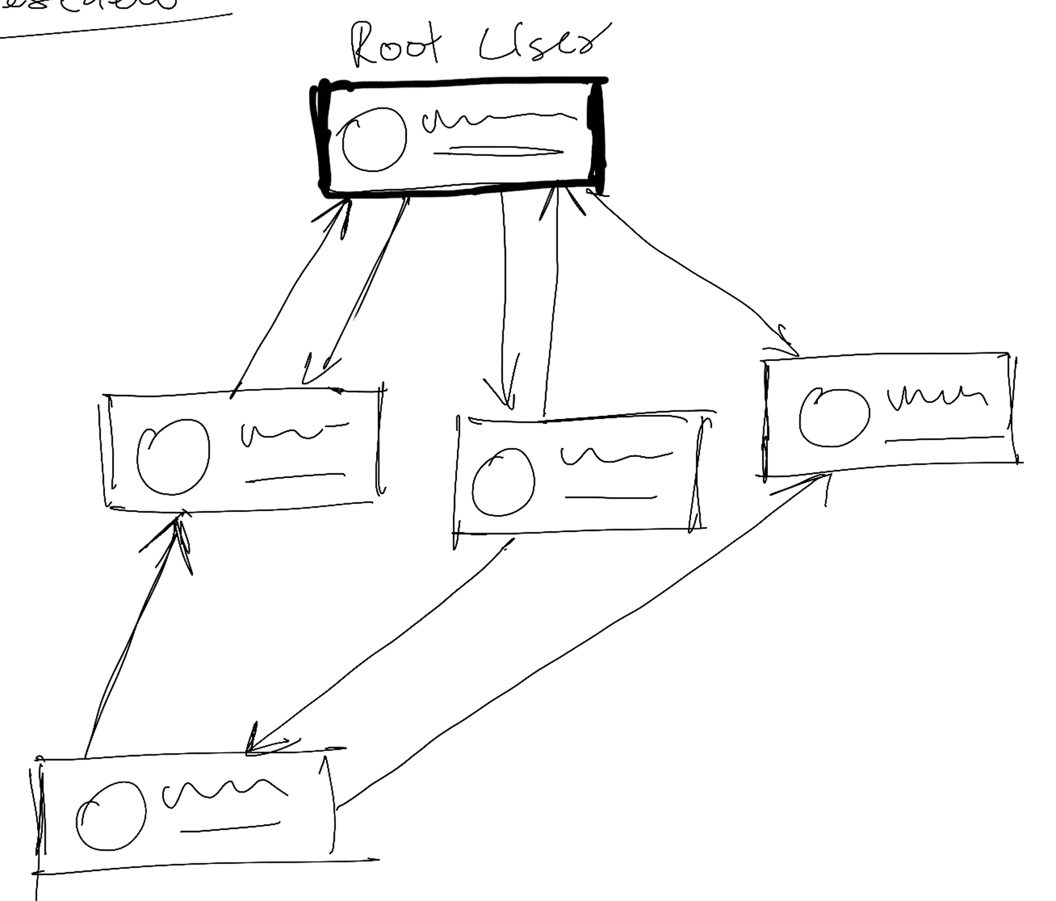


Early sketches of how "Spiderview" would work were loosely based around how Sankey and 1-N style node diagrams worked. These sketches helped me conceptualise transaction flows across nodes.
Design explorations

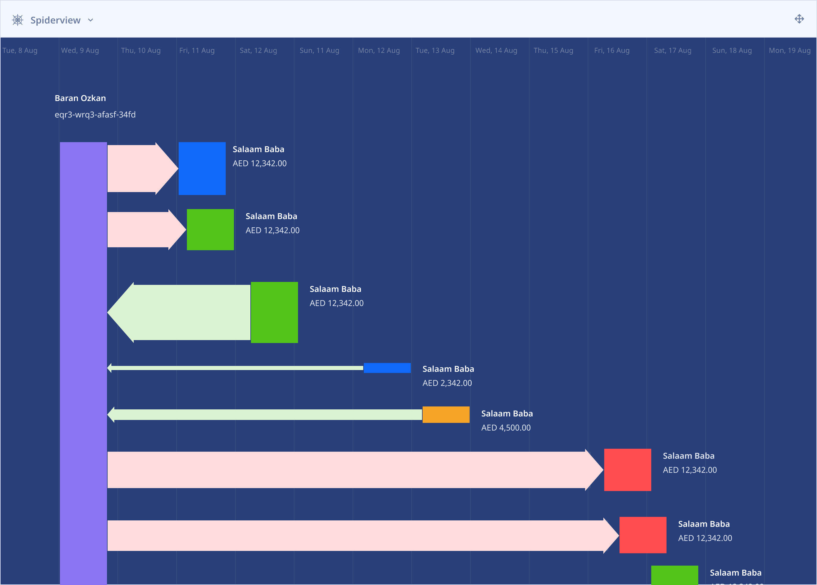
V1
The earliest version was based on a Sankey diagram, where the Source node is purple and .paths are mapped out to destination nodes. The date and time filter appear at the top of the card and moves forward as the user scrolls down the page.

V2
I extended the concept of the Sankey diagram to adjust the height of the destination node based on the value of the transaction. However, this was not scalable for thousands of nodes simultaneously.
V2.1
Directional lines and tints of green and red indicate safe or risky transactions respectively. I updated the colours of the destination nodes to identify their risk level. This too was unscalable and hard to uniquely identify multi-node paths.
V2.2
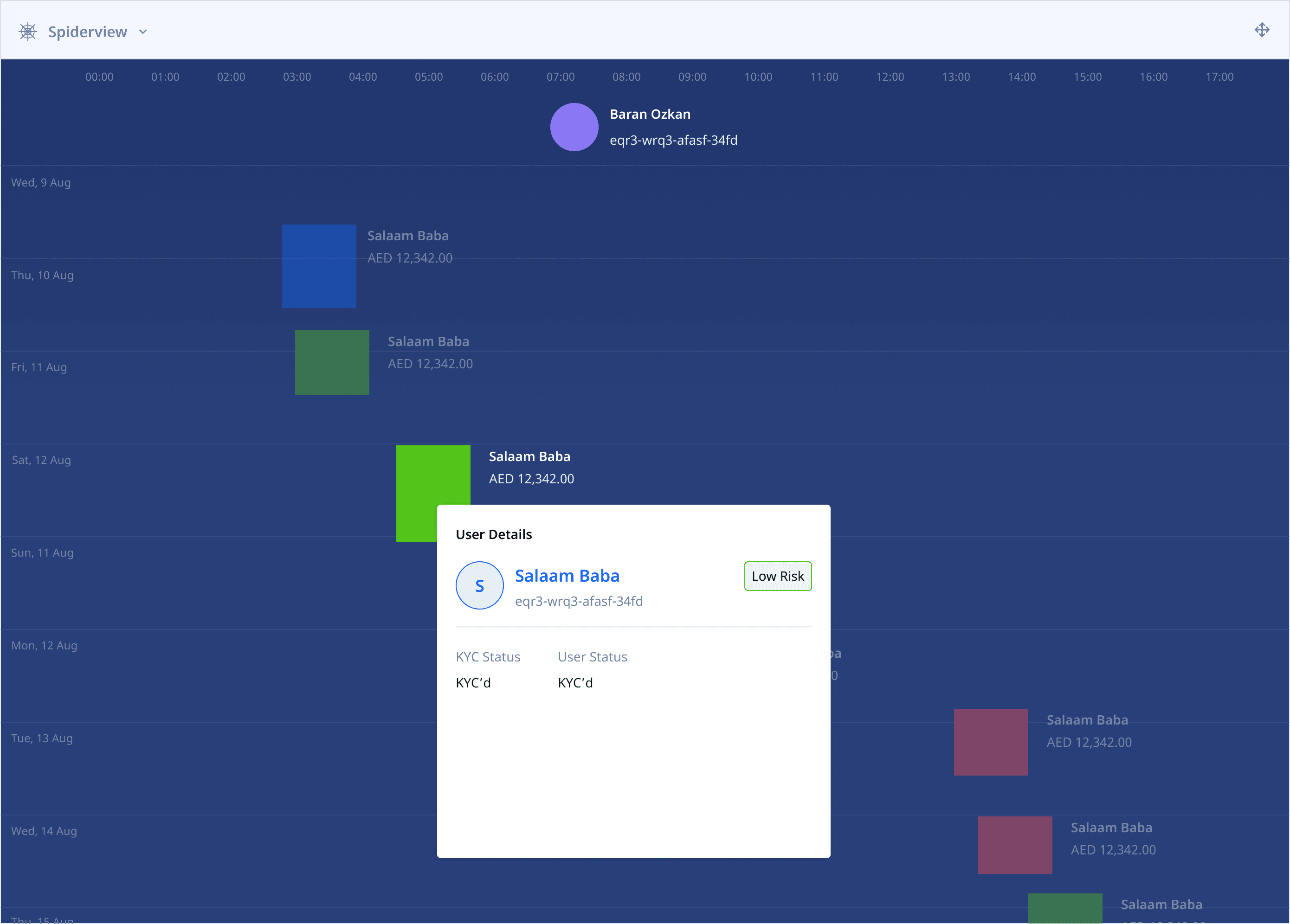
Replaced the vertical Source node with a circle to visually distinguish source nodes from destinations. Clicking on a destination node reveals risk details and additional information about the person. Other nodes are muted to bring focus to the active destination.

V3
I created a new concept based on some of the initial sketches, where users could easily see thousands of transactions between sources and multiple nodes simultaneously just by panning the screen. This version finally came to be known as "Spiderview".
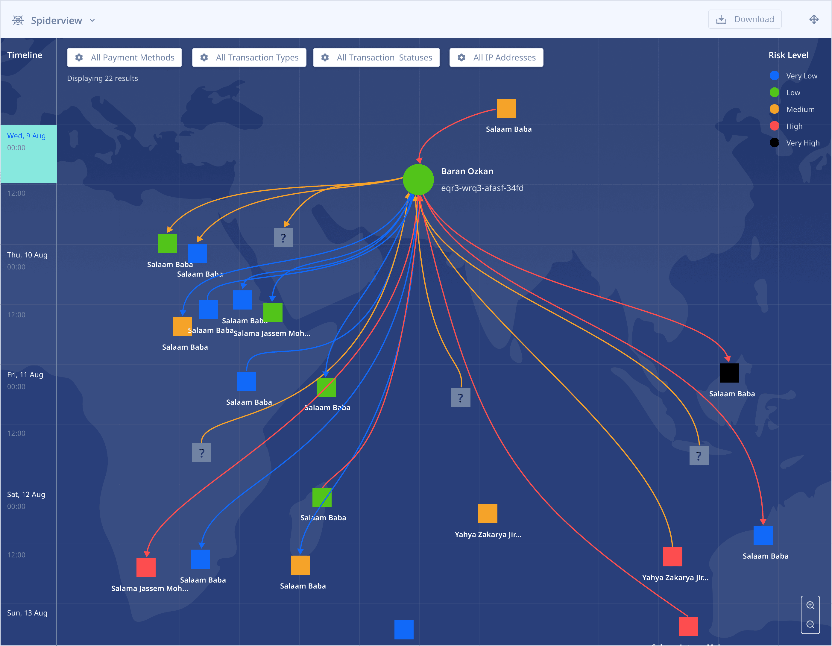
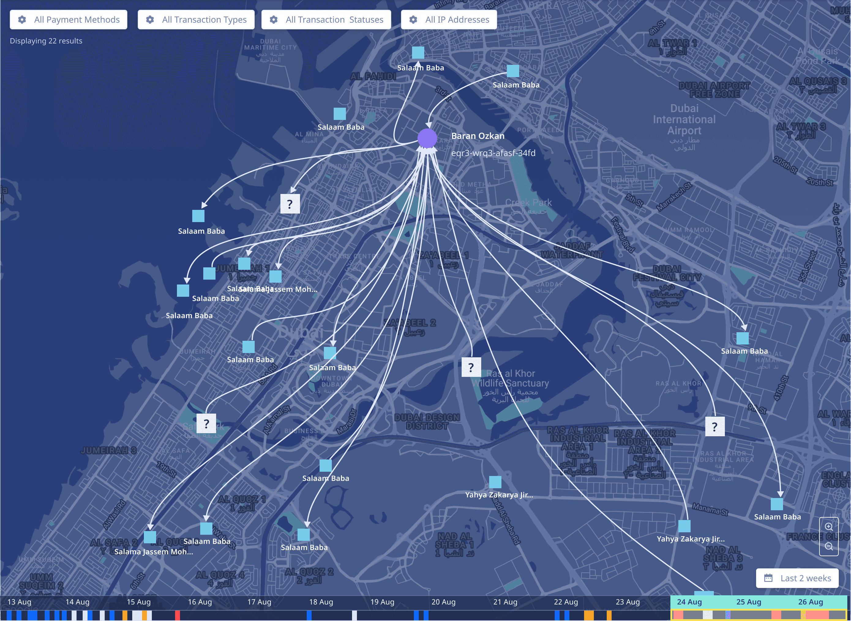
V3.1
Added a map layer to show the actual geographic location of the sender and receiver when the transaction was made. I also added a Risk Legend to explain the node colours and filters to drill down to specific transactions and simplify the UI.
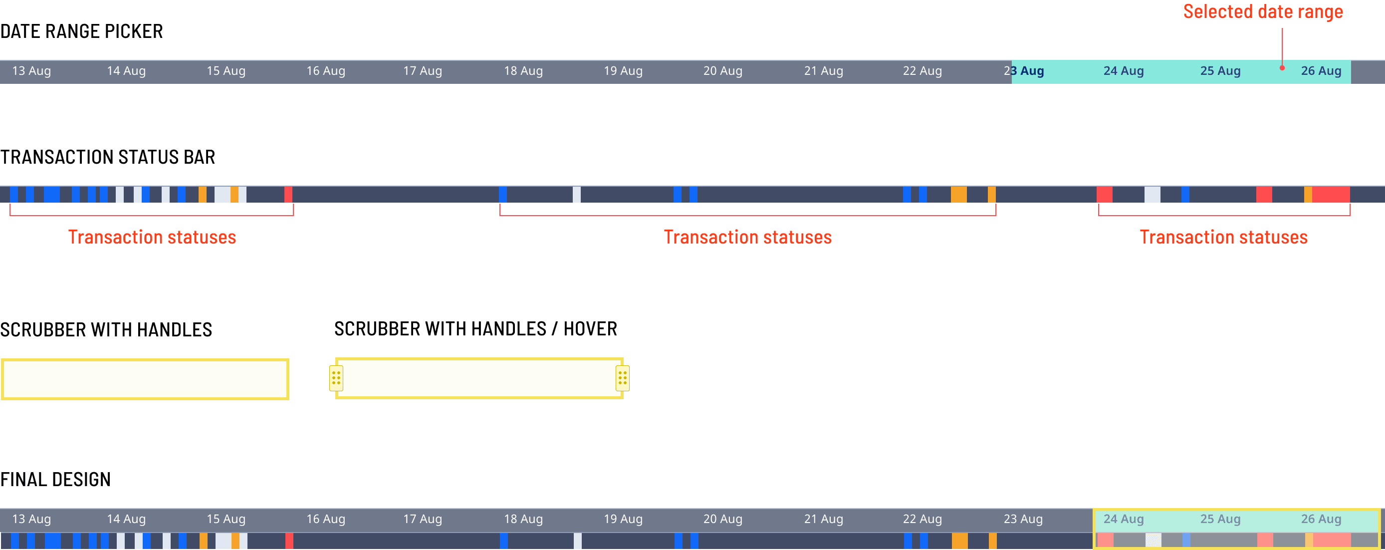
I added a fixed, interactive date and time range selector to the bottom of the Spiderview which displays all the transactions that have taken place within the selected period.
Additionally, I also designed a Transaction Bar that displays all the transactions and their statuses below the corresponding dates in the date range picker.
Final Designs
Left
Spiderview without accounting for risk. This design shows the direction of flow for a transaction from a source node. The scrubber over the timeline at the bottom can be dragged to adjust the date range.
Bottom
Spiderview in Fullscreen with risk displayed at a node level. Users can adjust fidelity by using the magnifying glass options in the bottom right corner.
Single-path
transaction details

Multi-path
Transaction Details

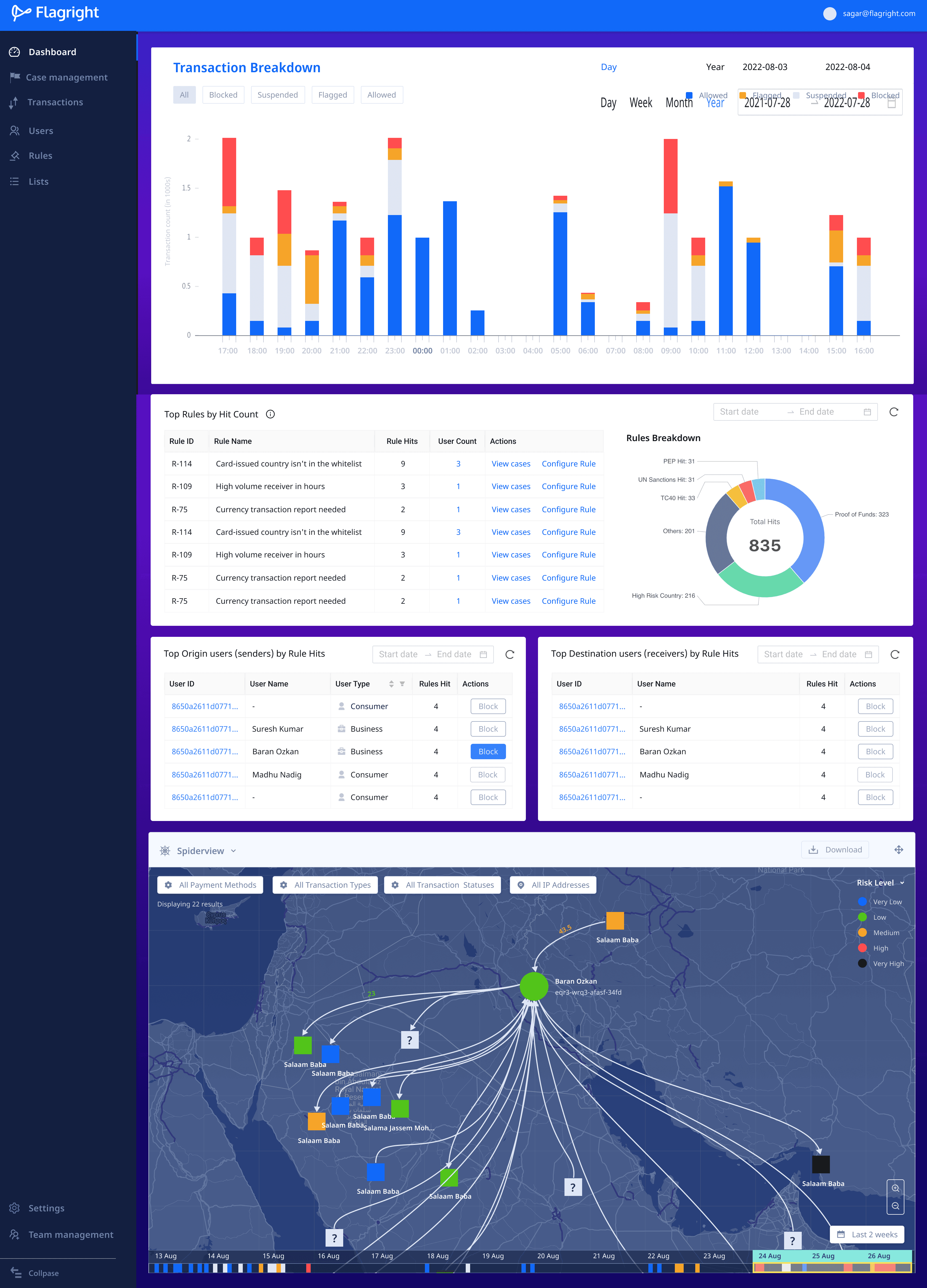
Spiderview as a card
within the dashboard
Case management
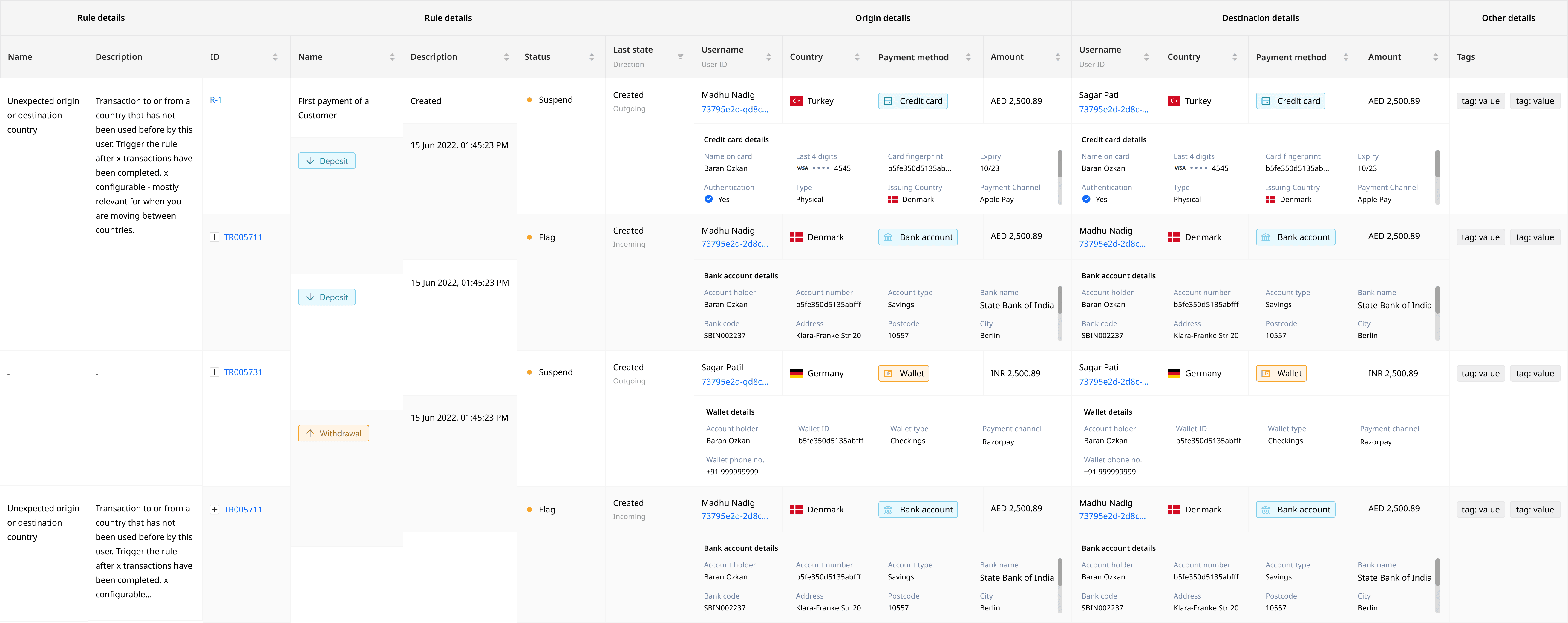
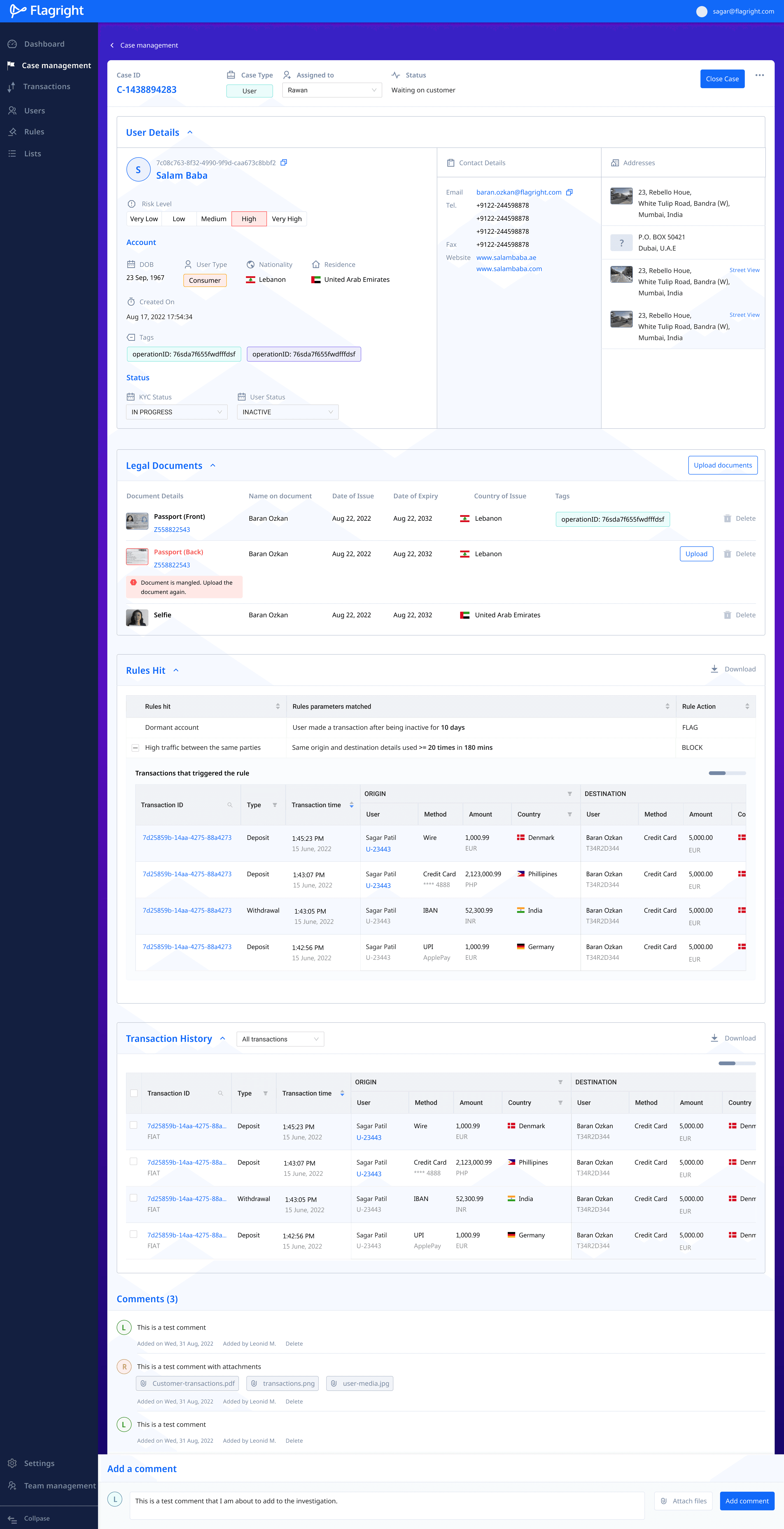
When a transaction has been flagged, suspended or blocked, the compliance team is usually interested in learning more about the sender and receiver, and particularly, their financial history and health.
Compliance teams open a case file that captures all the information about the transaction, sender and receiver. They can add additional notes, files, links and comments to this case file to give context as to why the transaction or user has been flagged.
TRANSACTION CASES
Transactions that hit one or more rules in the Rules Library automatically appear under the Transactions tab of Case Management. Compliance teams use transaction data displayed for each transaction to determine if the right action has been taken on a transaction.

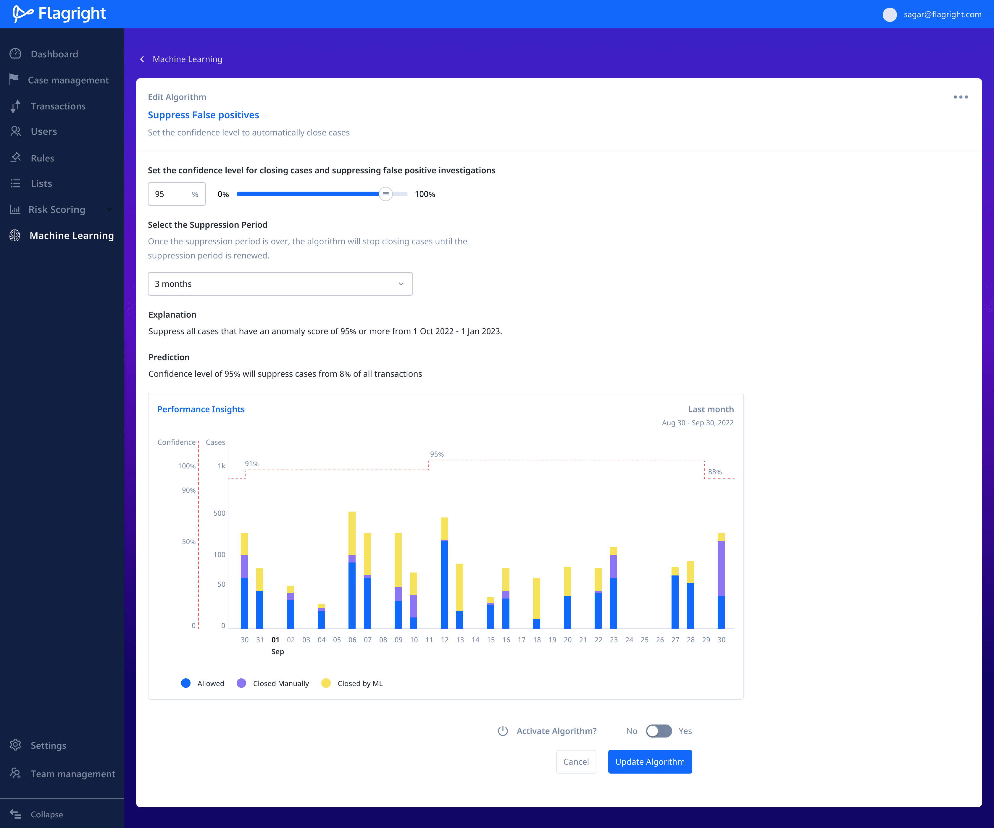
With machine learning enabled, users define a confidence threshold above which the AI automatically updates and closes cases, allowing users to only investigate the most important transactions and cases.

Existing screens of case management UI using the ANT Design Framework
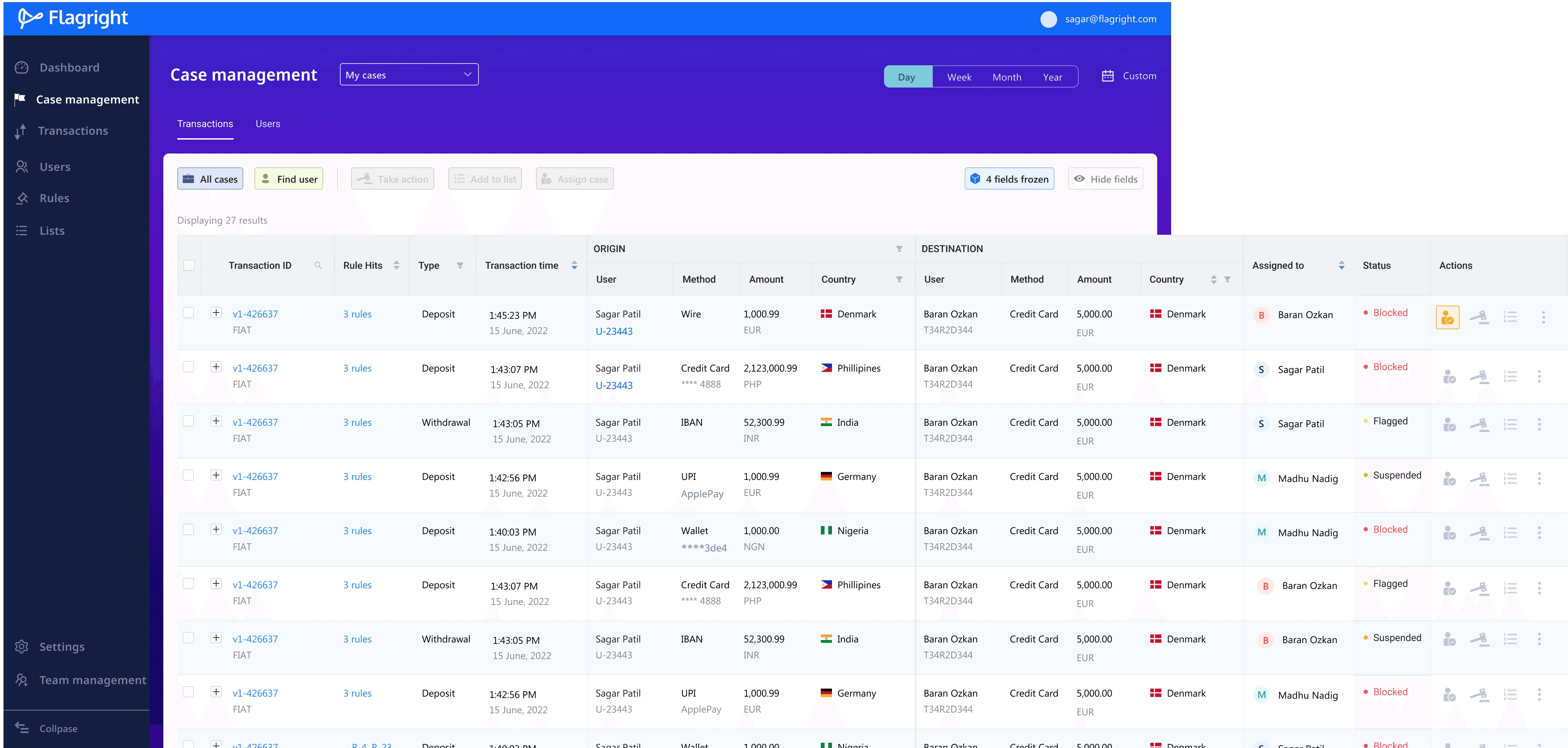
Redesigned case management UI along with tabs to separate transaction and user cases


Design variations for the Action bar that appears above the transaction table
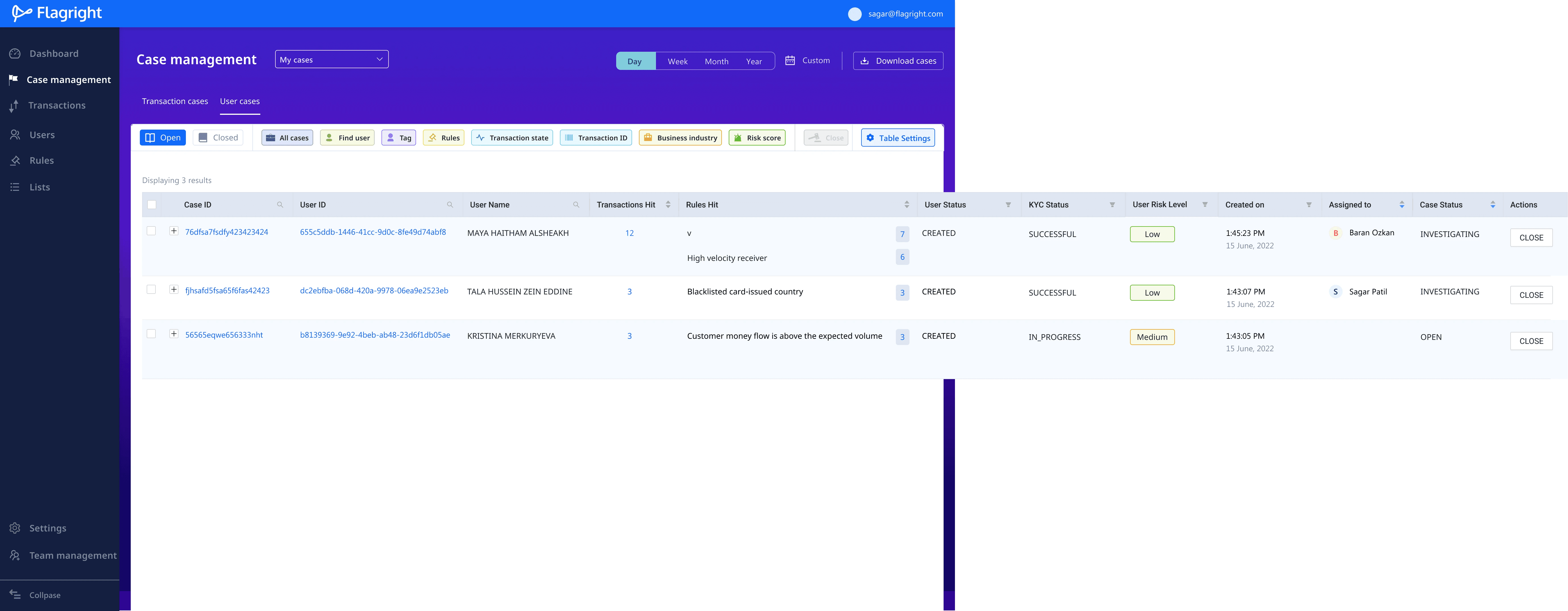
USER CASES
When a transaction case is created, a user case is automatically created for both the sender and the receiver. If the user case ID already exists, the existing case ID is updated with the latest transaction details.
In this way, compliance teams can compile a comprehensive dossier of a user's activity and if required, alert the police or the FATF (Financial Action Task Force).
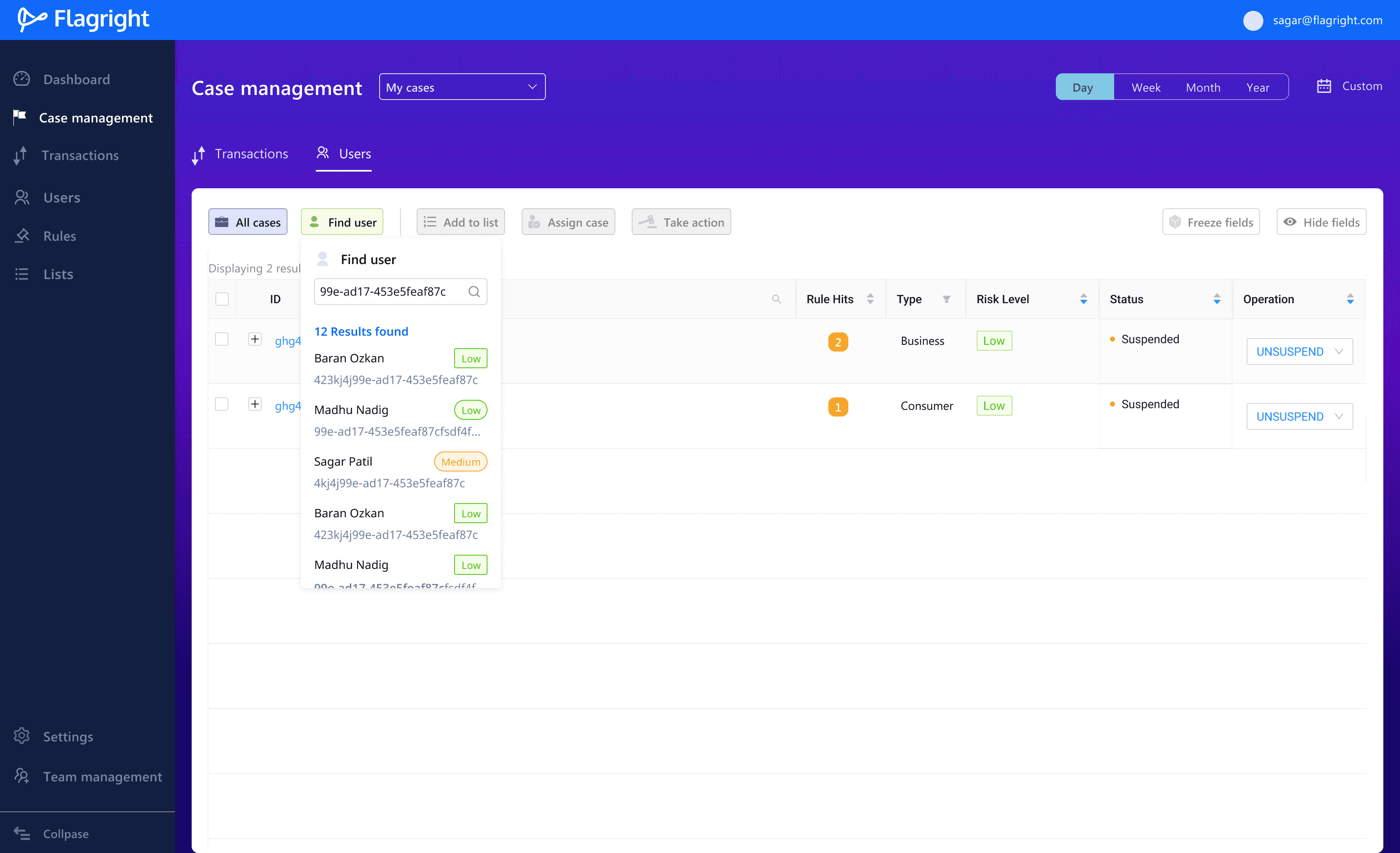
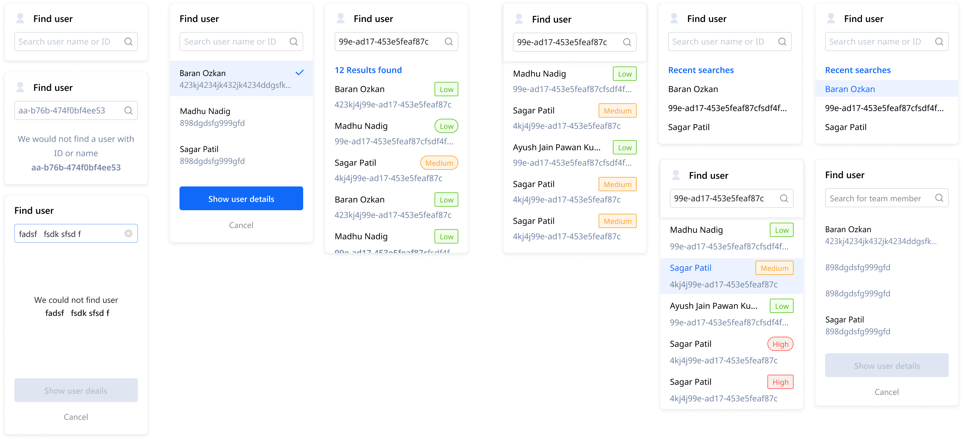
Designs for all the different states for when users try to find a customer
CASE Details
Case details are meant to be a comprehensive knowledge base of a user's demographic, financial and transaction history on a financial platform.
Compliance teams use the details of a case to create a Suspicious Activity Report (SAR) which is a summary of user information and activity including the action taken on the case and suggested next steps.

Why is a SAR important?
SARs serve as the primary intelligence tool for law enforcement to detect, investigate, and prevent money laundering, terrorism financing, and fraud. Hence financial institutions are required to maintain detailed case records of transaction and user data.


Example of a Suspicious Activity Report that is required to be completed by financial institutions if they suspect fraudulent or illegal activity.
Final CASE details Design
Case details include contact information, location details, legal documents obtained through KYC and registration, rules hit by transactions and the transaction history.
Customers wanted to be able to add comments and attachments to a case while scrolling through the case file. To accommodate this, I added a comments bar that stayed fixed to the bottom of the screen, so that users could add comments as they scrolled through a case.

Sketches of how the comments box should look and flow
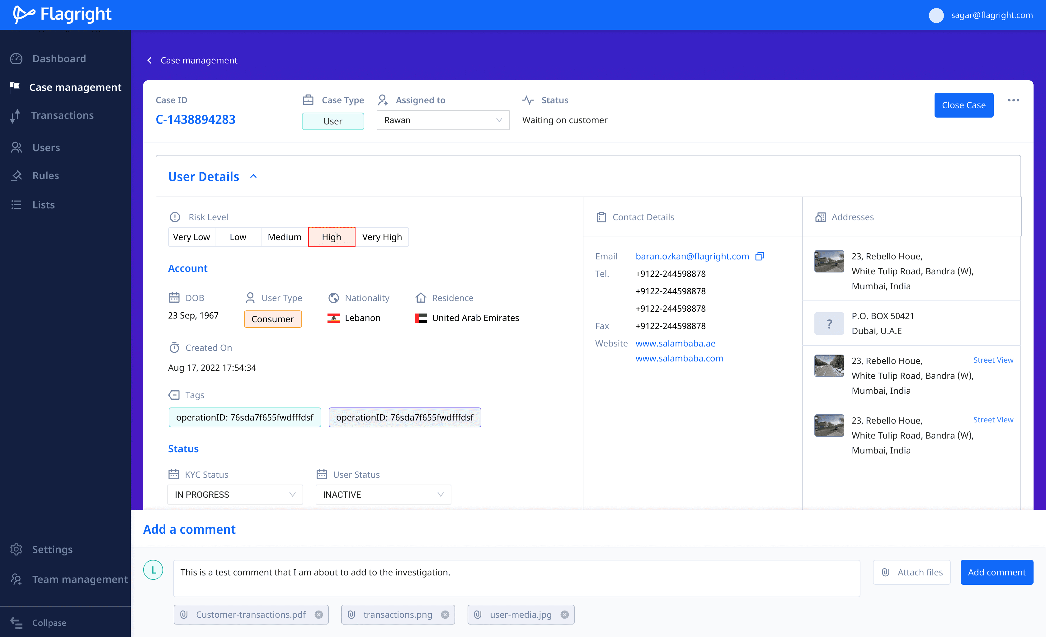
Comment box is fixed to the bottom of the screen to scroll along with the page. This way users can add comments as they scroll the page.
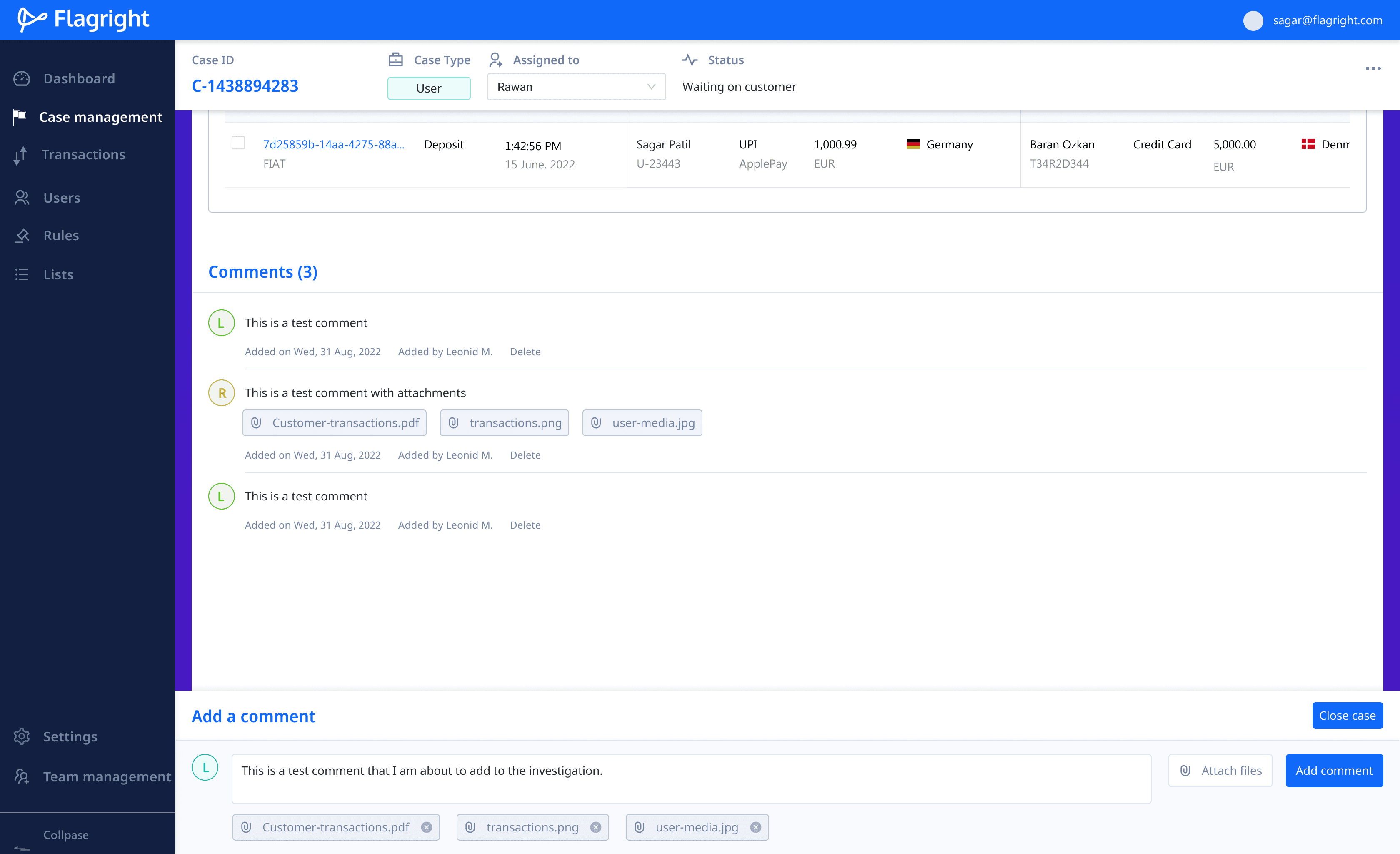
As users scroll the page, they can add notes and comments to the case. Comments from all users can be seen at the end of the case screen.
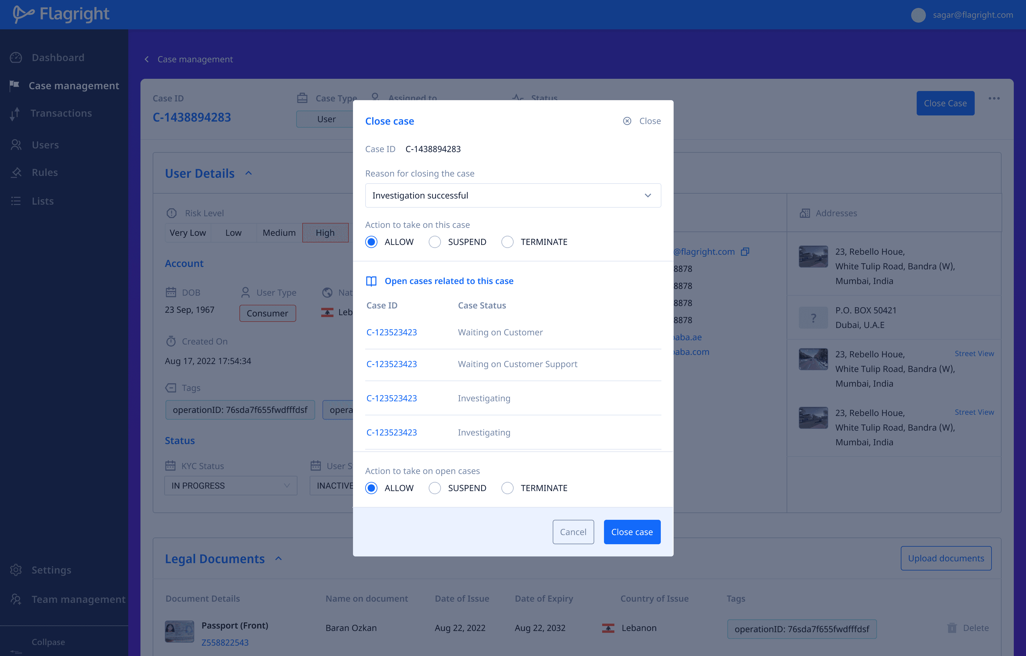
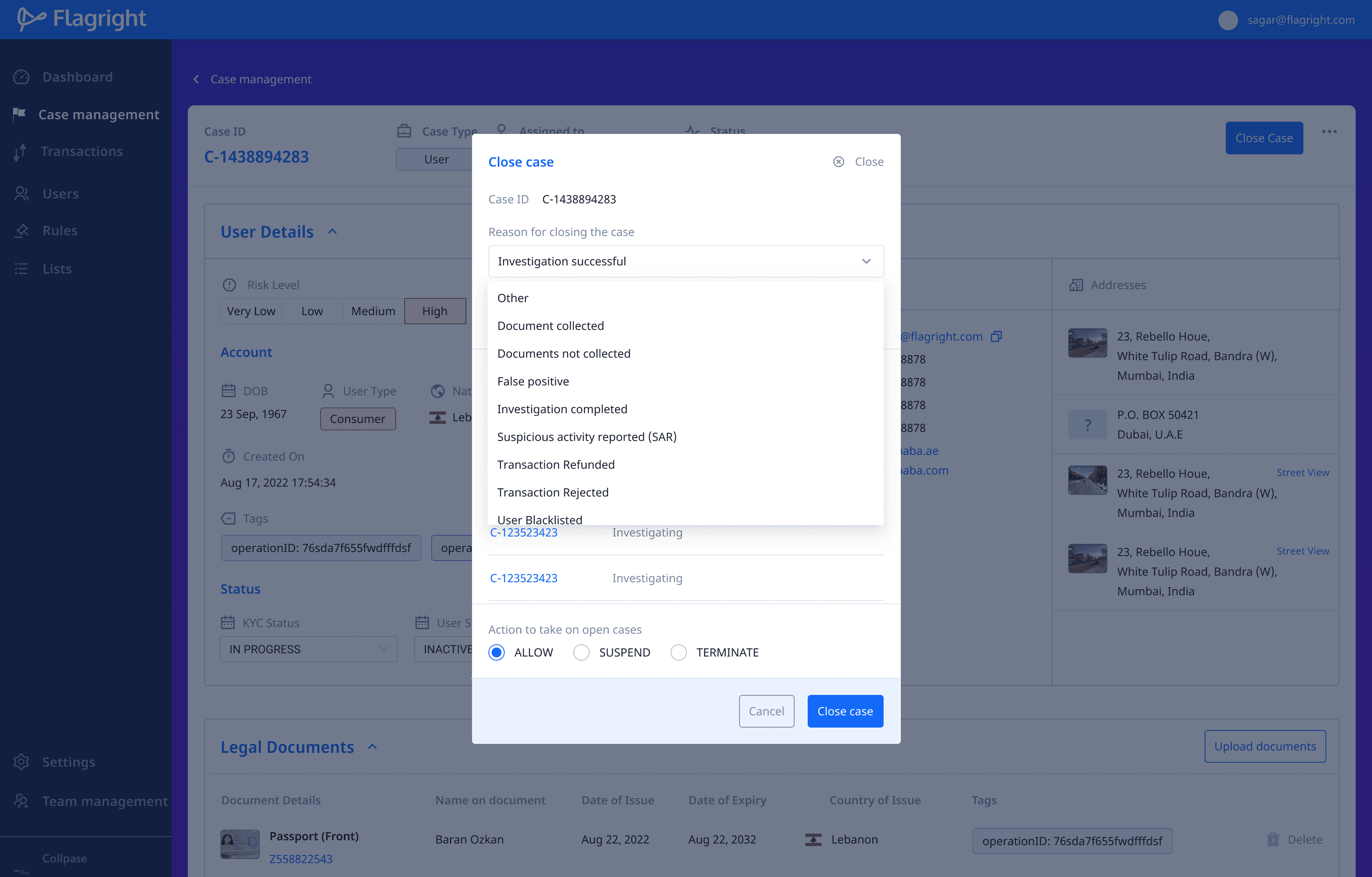
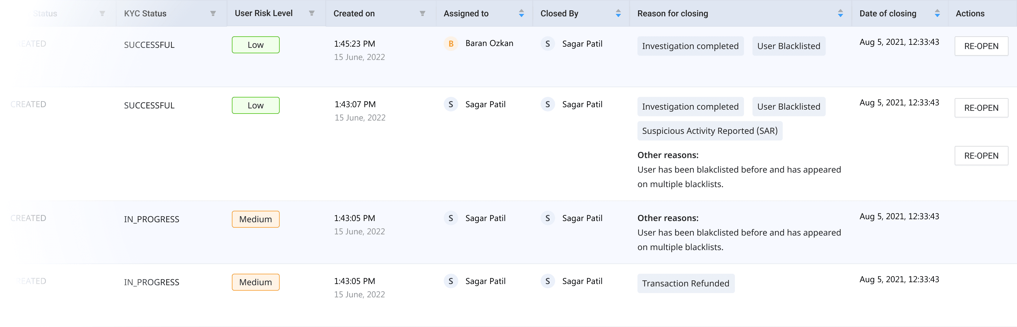
Closing a case
Once a case is reviewed, the compliance team needs to close the case and recommend the next steps that need to be taken. When closing a case, the team needs to provide reasons and evidence for closing the case.
A closed case can always be re-opened by a team member if they feel that the case has not been sufficiently reviewed.
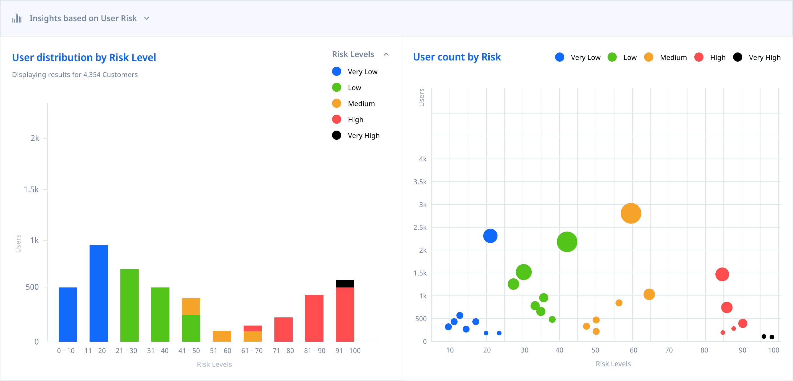
Case insights
We wanted to provide financial teams with quick and insightful data that they could take action on quickly, without having to manually browse and filter through transactions.
I designed a series of panels that represented important information in the form of graphs and charts. These panels could exist in either single, two or three column layouts.


Sketching out graphs and charts helped conceptualise visuals to highlight critical data points quickly and standardize labels, actions and buttons and their locations.
Final Design of
case Insight cards
All charts, except for Rules Hit charts were created in 1-column, 2-column and 3-column variants to accommodate the size of the parent card and siblings. Rules Hit card was designed to be available as a single column only.
insights AROUND TRANSACTIONS
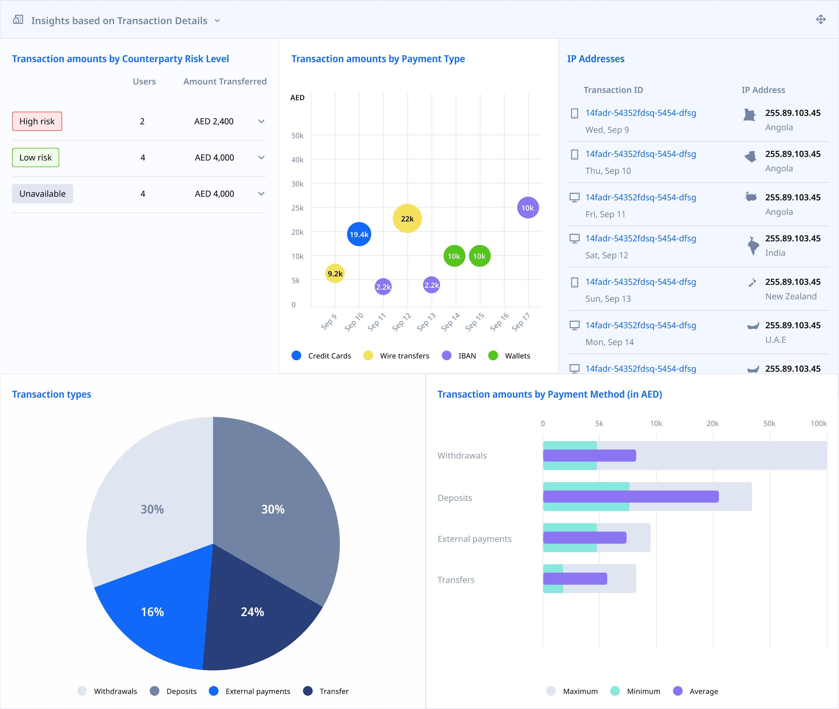
insights AROUND USER RISK
insights AROUND RULES HIT
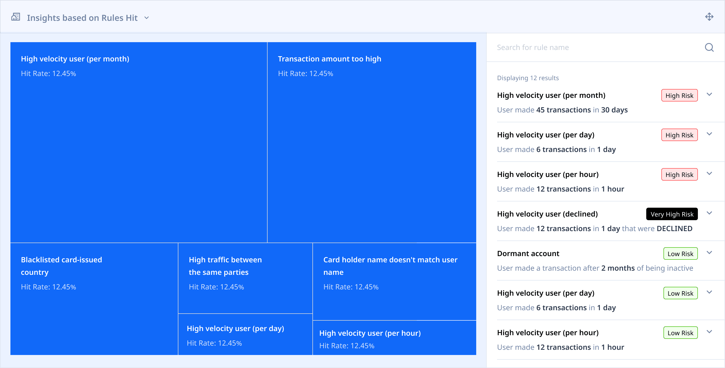
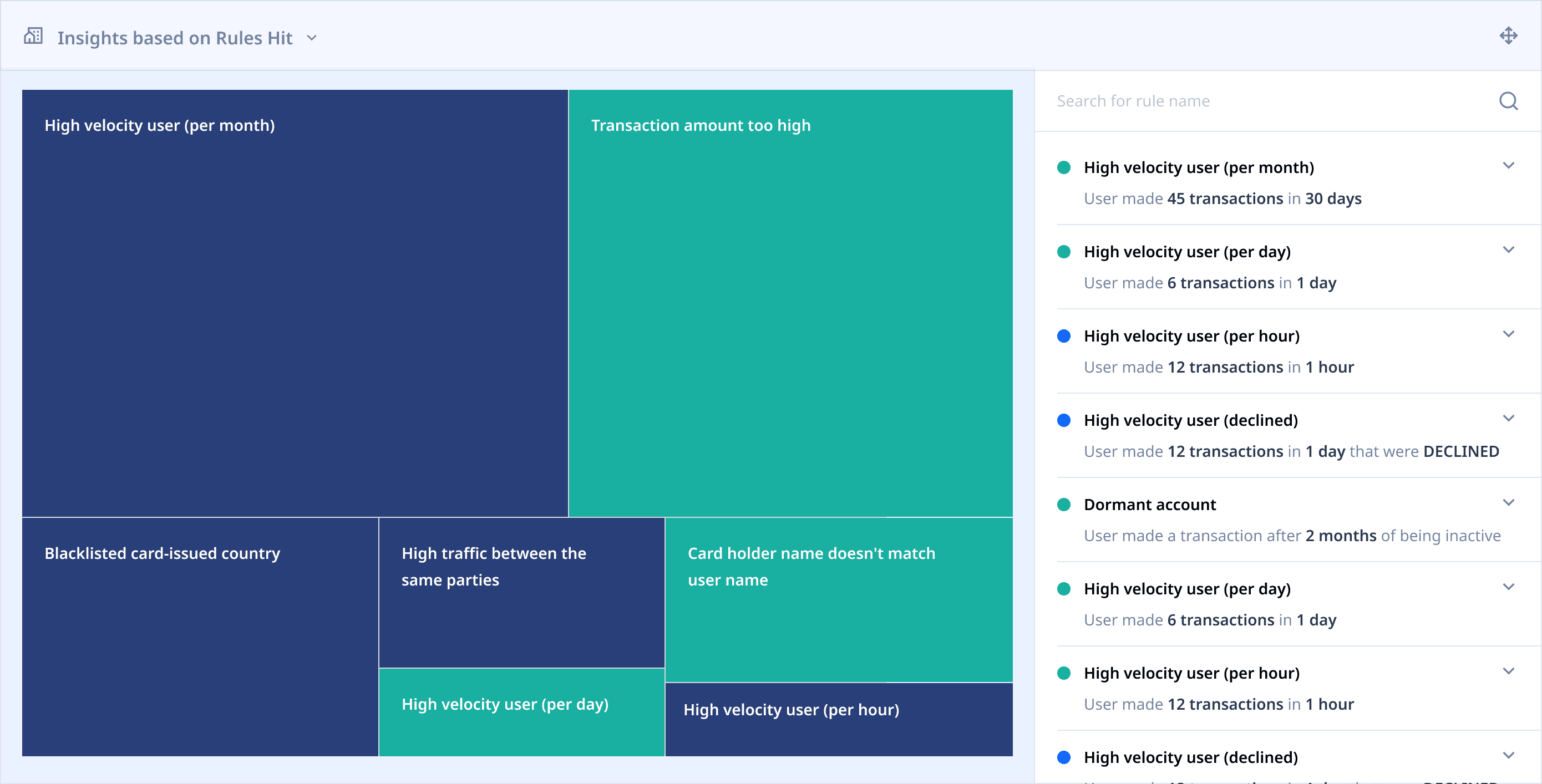
Displaying insights within case details

Learnings
As a principal designer, Become Deeply familiar with the industry.
I was unfamiliar with fintech as a whole, and even more unfamiliar with compliance the the world of financial crime. While I tried to educate myself about the compliance industry, there was a lot of information that could only be learned through real world experience and learning from a network. And while I found my groove towards the end of my stint, I wish I had reduced my knowledge gaps earlier.
Grid layouts are great for unpredictable interfaces
We wanted users to be able to customize their dashboard and case management interface, since different users are interested in different types of data. I iterated with 3x3 and 4x4 grids to create resizable panels that users could move around the UI, depending on where they wanted to see the information.
Acknowledgements
I appreciate the opportunity given to me by the founders, Baran Ozkan and Madhu Nadig. I enjoyed working with them and the Flagright team and am happy to see them grow and succeed.
Frankensteined in Mumbai.
Fueled by YouTube, 90s cartoons & Heavy Metal.