UX Design for reporting and managing cancer symptoms.
ROLE
Principal Product Designer
Period
June 2021 - Feb 2022
(8 months)
Zealth AI is a Y-Combinator (YC) backed startup that provides end-to-end remote monitoring for patients diagnosed with chronic illnesses like cancer and diabetes. Between July - September 2021, I consulted with Zealth AI and worked closely with Dheeraj Mundhra and Monika Mehta to redesign the UX of CareShare - Zealth's flagship product - using UI components designed by Roni Biswas.


Challenge
Cancer patients and caregivers often express confusion, frustration and helplessness when trying to understand what is happening. They are impatient and want to contact a doctor immediately. However, patients abandon medication and nutrition schedules when they feel better, making recovery slower. Furthermore, they revert to old habits once they feel like they have fully recovered.

Solution
Designed apps for both, patients and doctors. Patients report symptoms in-app or book a video call. Doctors get notified immediately and can see the triaging score - a score based on historical patient data, symptoms, existing patient queue and more. Patients also get notified about upcoming medication and meals as well as any updates to their schedule, and are encouraged to stick with the schedule.

Impact
Piloted hospitals
2
It was challenging getting hospitals to pilot the app as doctors were often busy, used to their existing system and were not receptive to the idea of digital triaging.
Patient Experience
abandoned
Caregivers initially tried the app but reverted to calling or messaging doctors over WhatsApp as they wanted immediate solutions to relive the patient's pain.
Doctor Experience
unimpacted
Doctor's continued to rely on patient communication through WhatsApp, while they preferred triaging be done by the front office staff.

in-depth version
Competitive analysis
We reviewed landing pages, navigation menus and feature sets of popular competitors like Onco.com, Fitterfly, Fitbit, etc., to understand how the competition designed their experiences. Comparing these designs with data from our user interviews helped identify the primary user problems that CareShare wanted to solve.
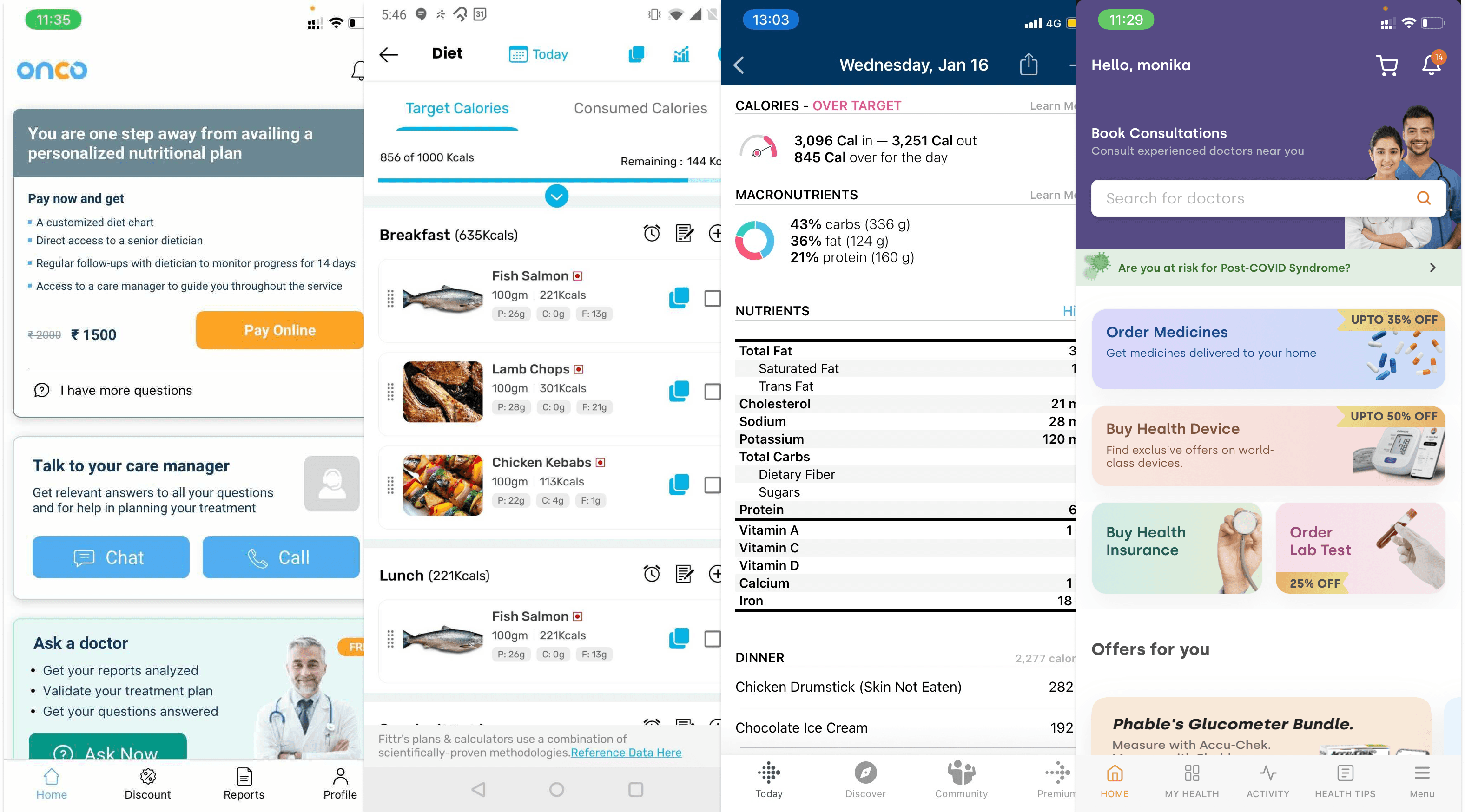
We reviewed the features and UX of commonly used health tracking apps and local competitiors like Onco.com, Fitterfly and Fitbit amongst others.
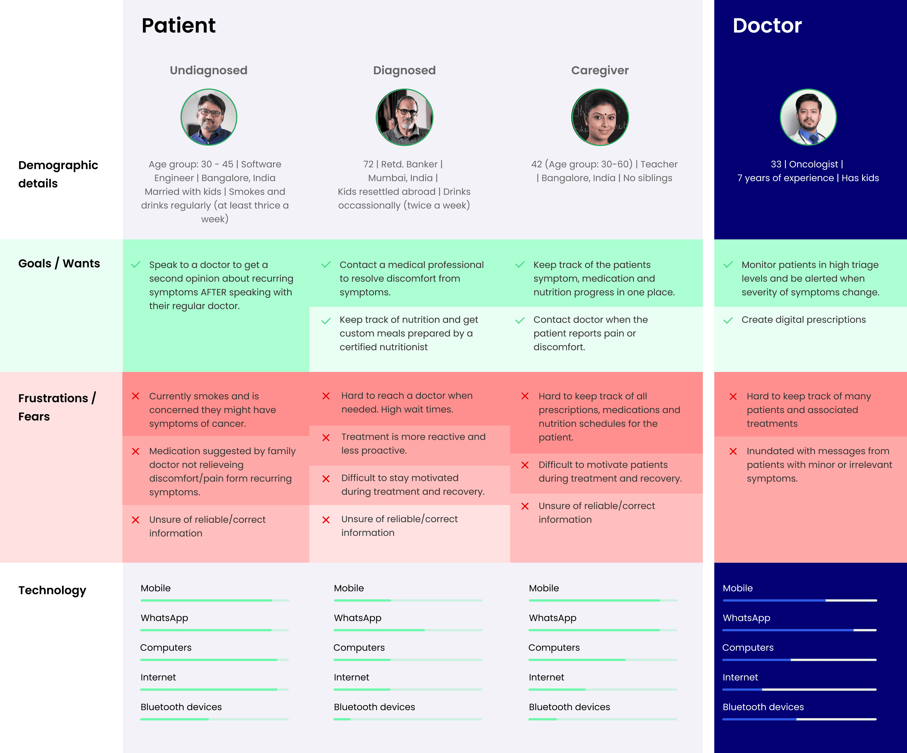
Understanding our users
Zealth AI offers separate apps for patients and doctors, similar to how Uber has separate apps for riders and drivers (partners). Based on user interviews, we designed personas to represent the different types of users that would be using the CareShare apps. We were able to narrow down our user set to three types of patient personas and a single doctor persona.
We reviewed the features and UX of commonly used health tracking apps and local competitiors like Onco.com, Fitterfly and Fitbit amongst others.
We identified five primary user goals that we wanted to solve:
Reporting and monitoring symptoms
Online video consultations
Nutrition management
Medication adherence
Digital prescriptions
Reporting and monitoring symptoms
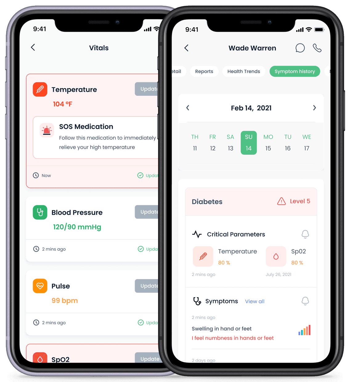
To accurately diagnose and treat chronic illnesses like cancer, doctors need to be aware of the symptoms a patient experiences, when they experience these symptoms and under what conditions. Knowledge of a patient's health history along with regularly measured vital stats helps doctors diagnose symptoms better and plan the next steps of the treatment regimen.
Health history
Traditional paper-based medical forms are time consuming and prone to human error. I designed cards using visual cues and tap-based input to make the process of entering data faster and less mundane. I added defaults and suggestions based on patient history and designed pre-filled templates to reduce the tedium of completing paper-based forms.
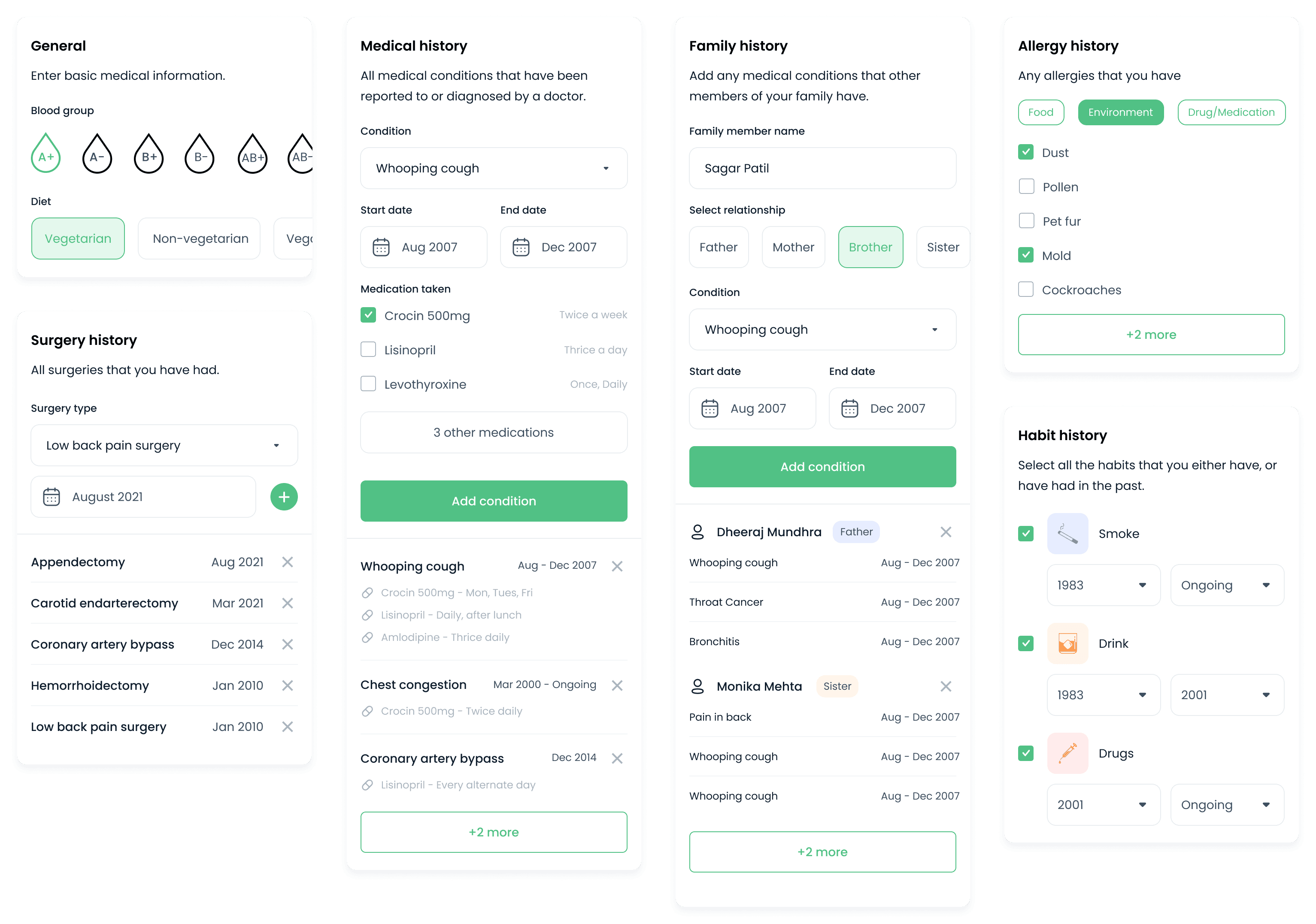
I designed cards with tap and select input to speed up the process of completing lengthy medical forms. These cards are reused as pre-filled templates in other sections like digital prescriptions to reduce the time to fill out a prescription.
Reporting symptoms
Patients often experience one or more symptoms of an illness simultaneously. The diagnosis and subsequent treatment plan for each patient will vary depending on their demographic information, health history and vital stats.
We designed an intuitive step-by-step UI that allows users to select multiple symptoms, highlight where they are feeling pain and rate the severity of their pain on a medically approved pain scale. The CareShare algorithm processes this information along with the patient's historical data and updates the user's health graph, suggesting instructions and medication to relieve the symptoms.
Screen 1
Landing screen for reporting symptoms

Screen 2
Typing in the search bar displays matching results
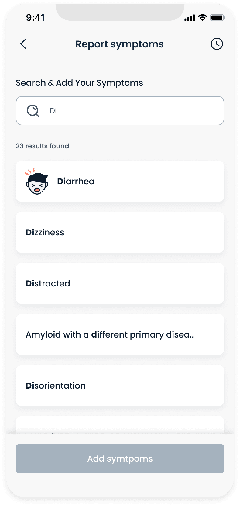
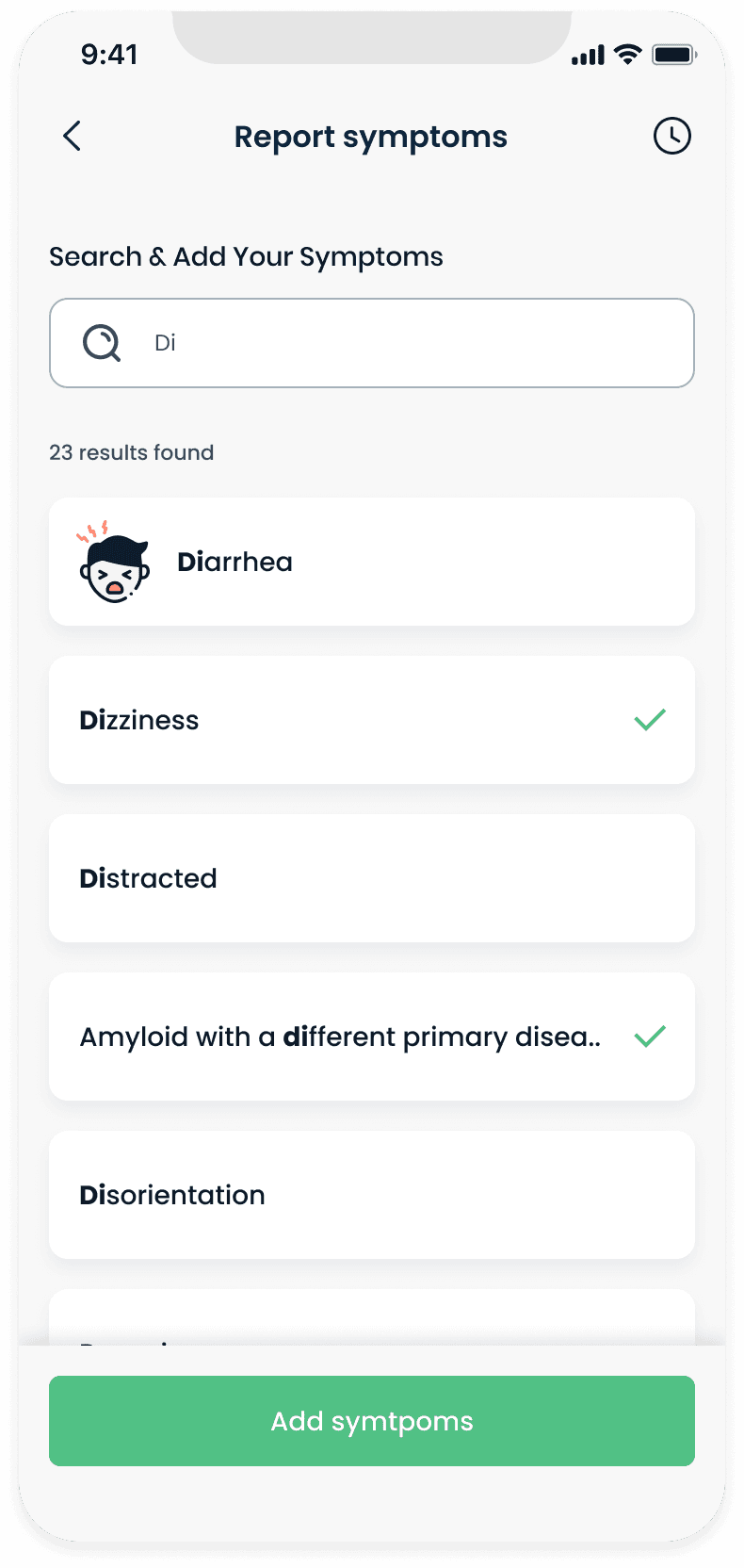
Screen 3
User selects symptoms they are experiencing
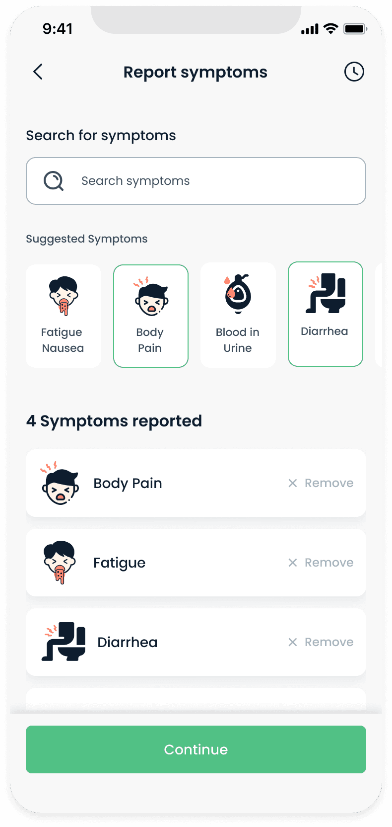
Screen 4
Once the user has added all symptoms they can continue to the next step
Screen 5
User can select where they are feeling pain. Tapping the same spot multiple times changes the severity.
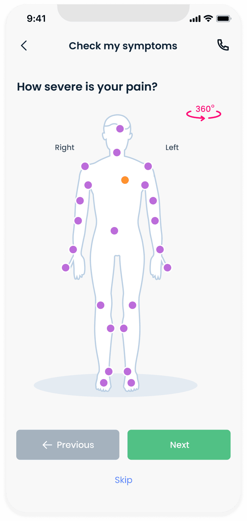
Screen 6
Pain scale for overall pain/discomfort

Screen 7
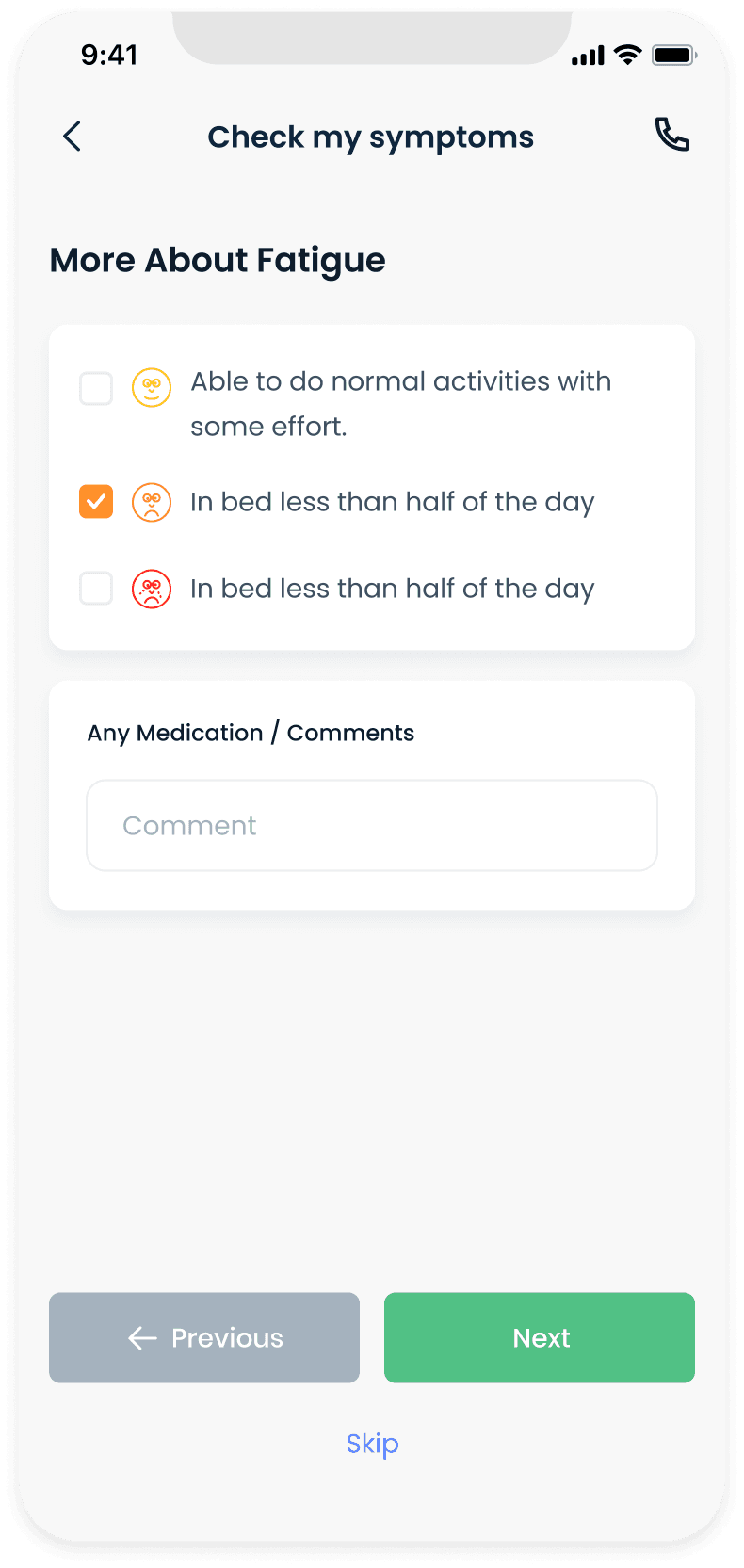
Fatigue specific question screen
Screen 8
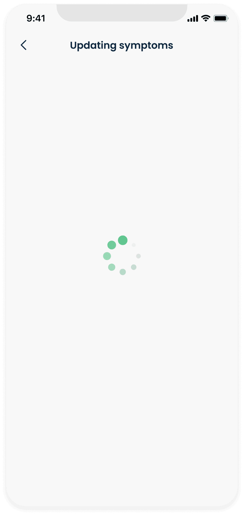
CareShare is processing the results
Screen 9
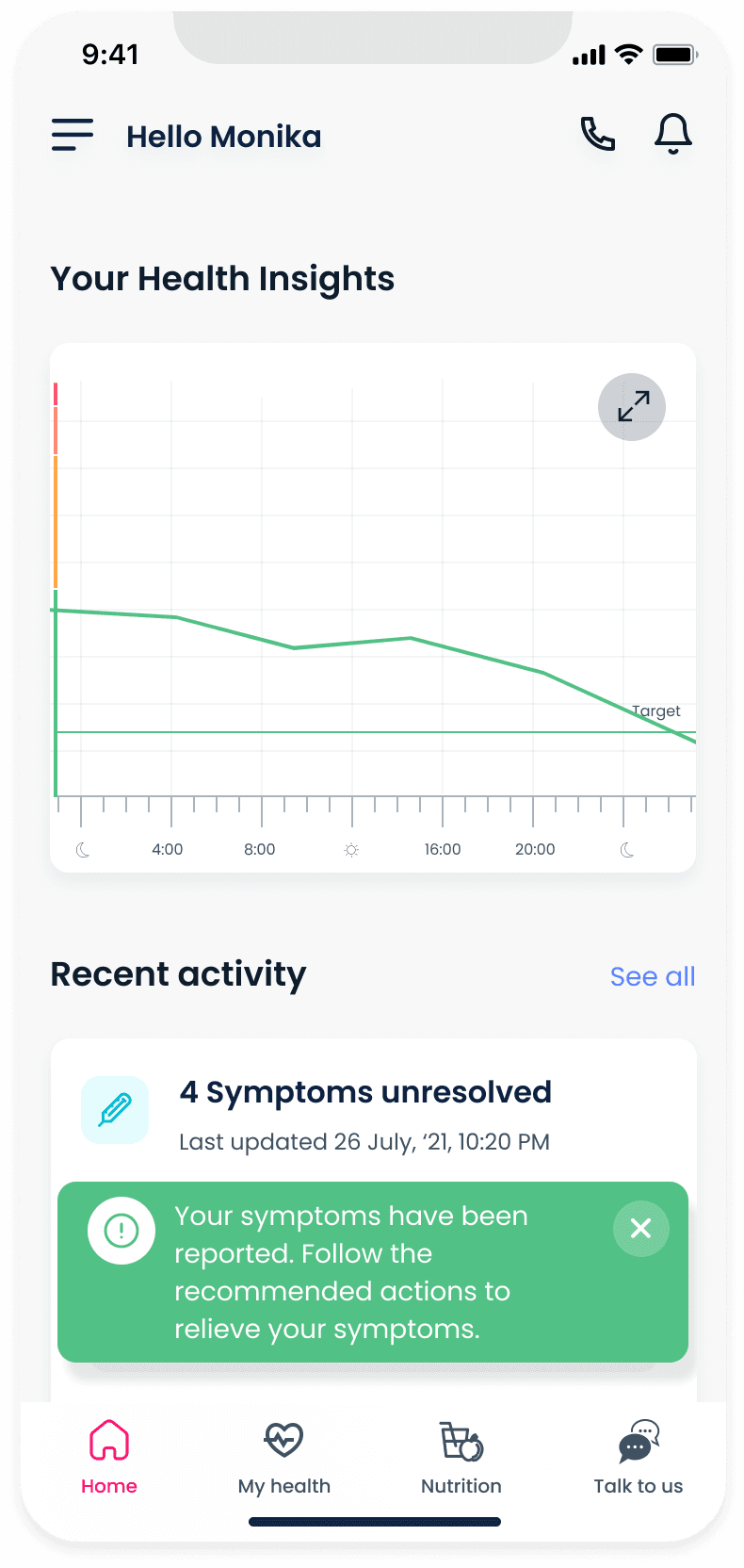
CareShare updates the patient's health-over-time graph and adds the symptoms to Recent Activity
Updating vitals
CareShare gets updated vital stat data through health tracking devices, Bluetooth enabled medical devices or direct manual input. Vitals are used along with symptom and health history to recommend accurate medication and instructions to relieve the reported symptoms.
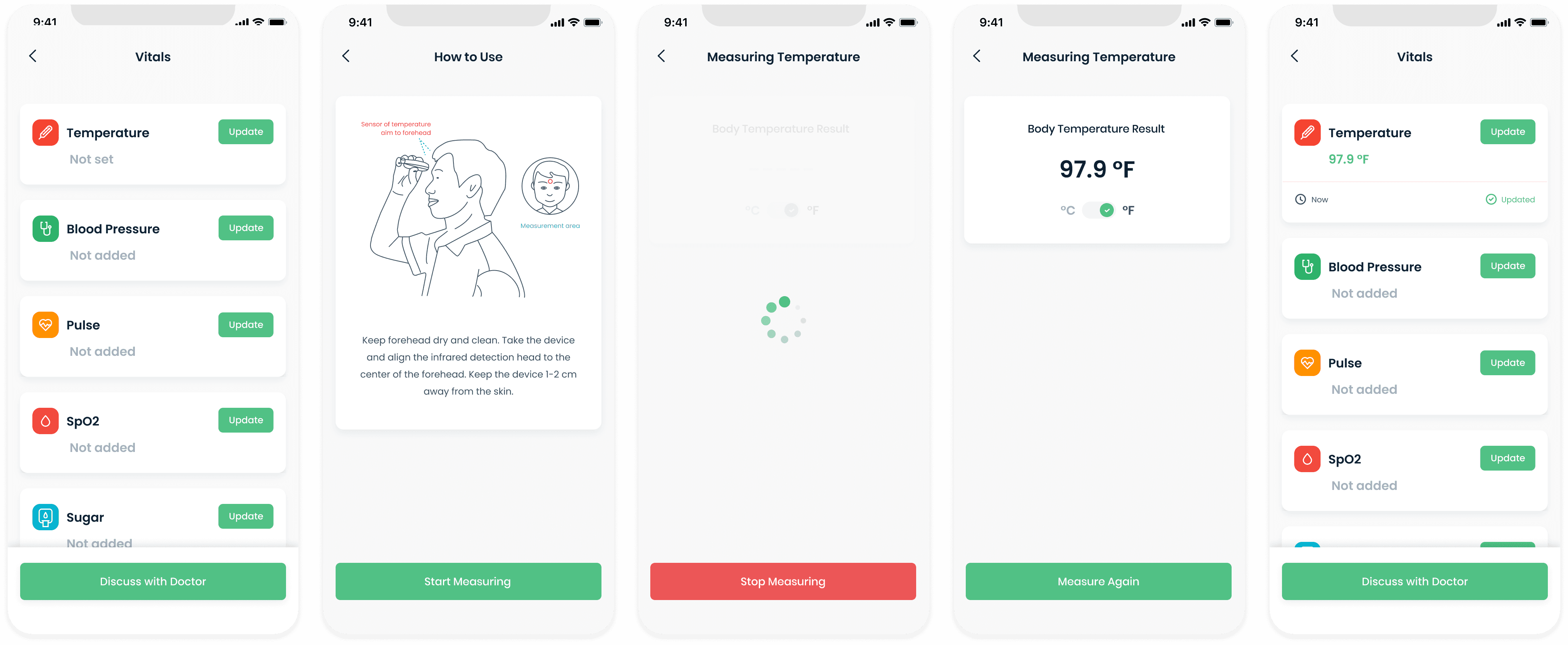
Different stages of reporting and updating temperature
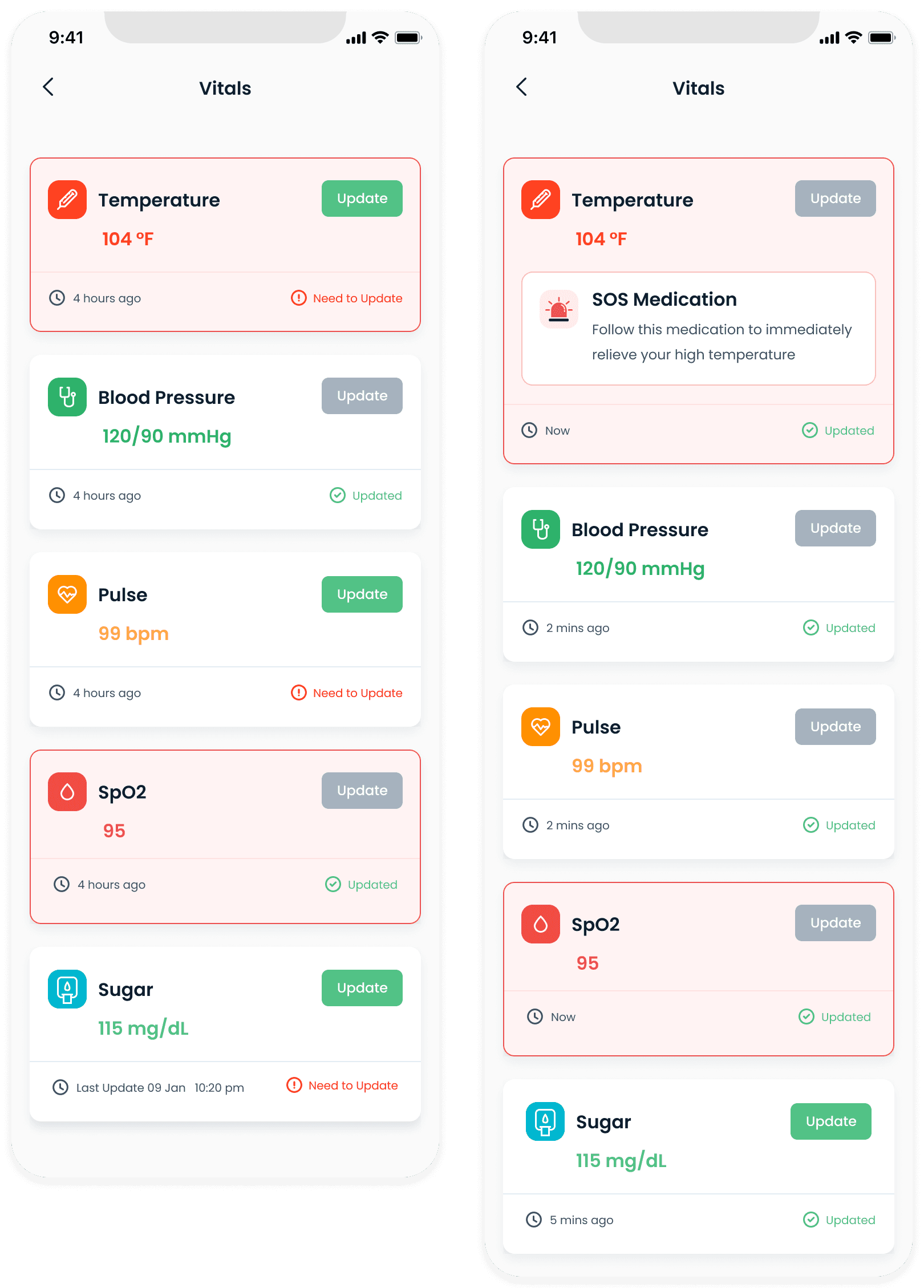
Abnormal vitals are highlighted in red. SOS instructions are displayed for vitals that are consistently abnormal and the patient is moved to a higher triage level.
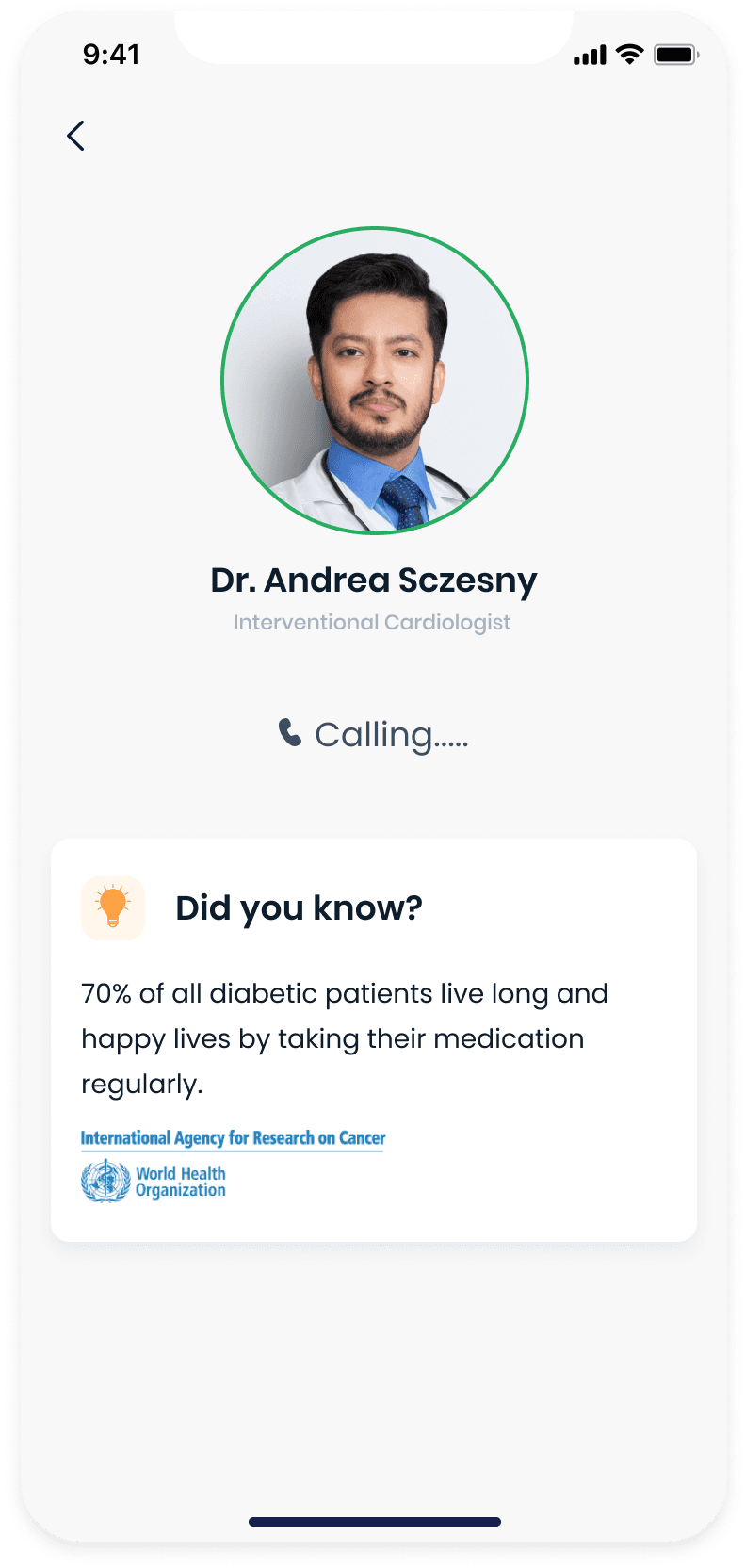
Online video consultations
Booking a consultation
Patients often want to get a second opinion from a doctor outside of their trusted sources. During our research, we found that a majority of cancer patients had been diagnosed only after a second opinion after their symptoms were persistant despite consulting doctors and using medication.
Screen 1
Browse or search for a doctor to consult with
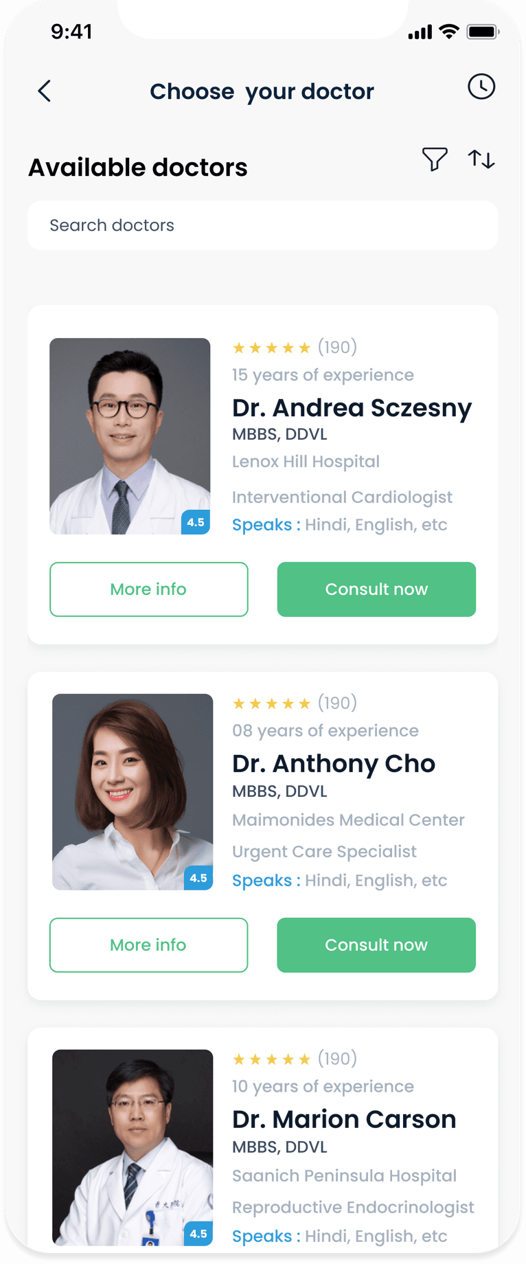
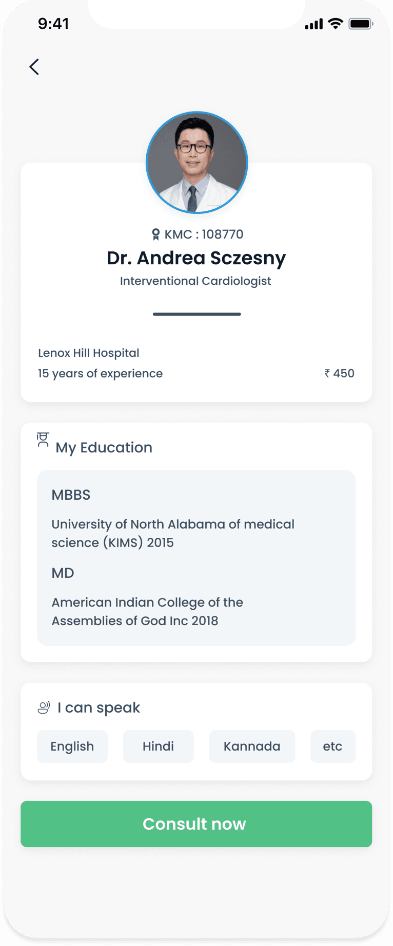
Screen 2
View doctor details
Screen 3
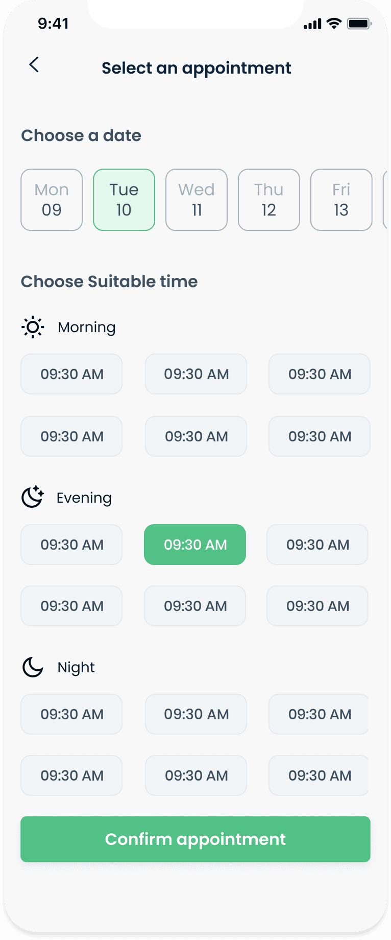
Select date and time for the consultation appointment
Screen 4
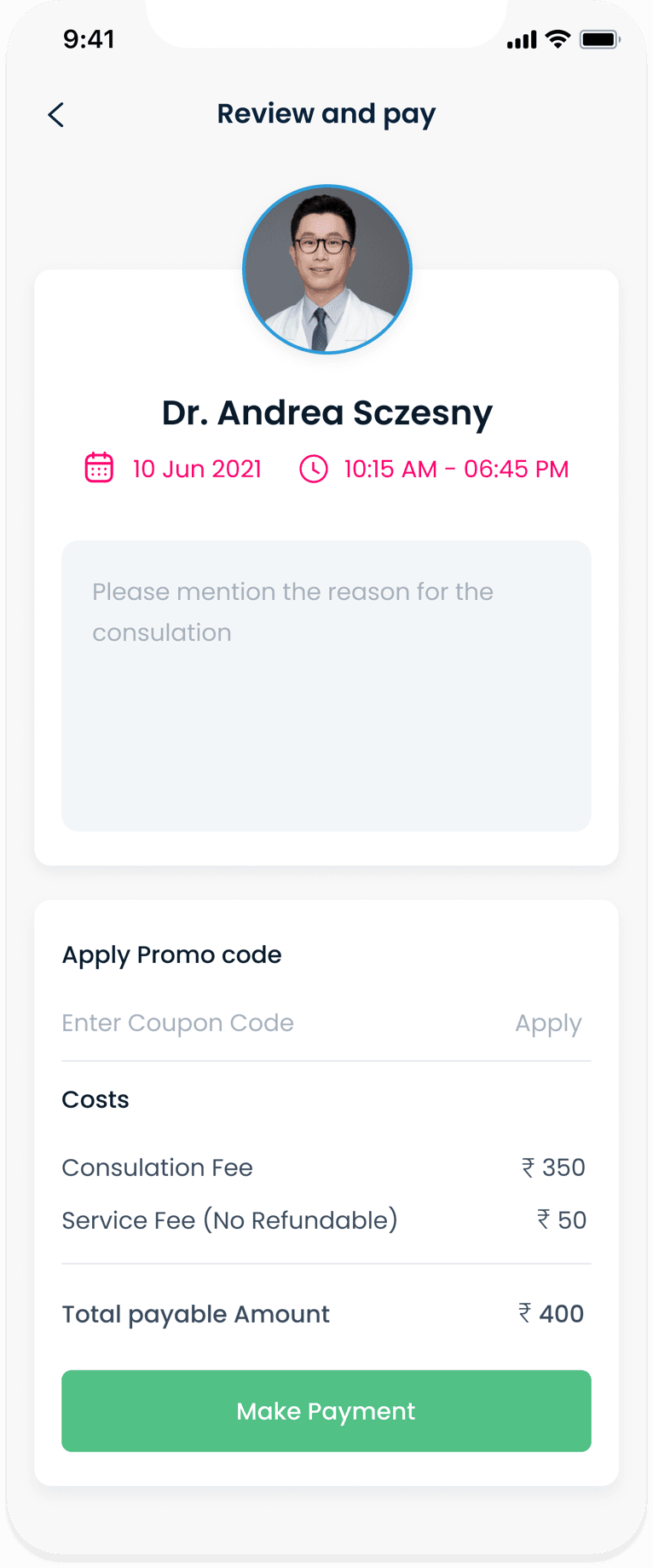
Review appointment and payment details
Screen 5
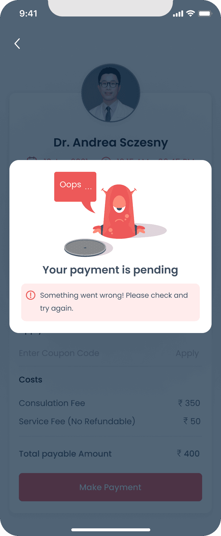
Failed transaction page, along with options to set reminders for the appointment
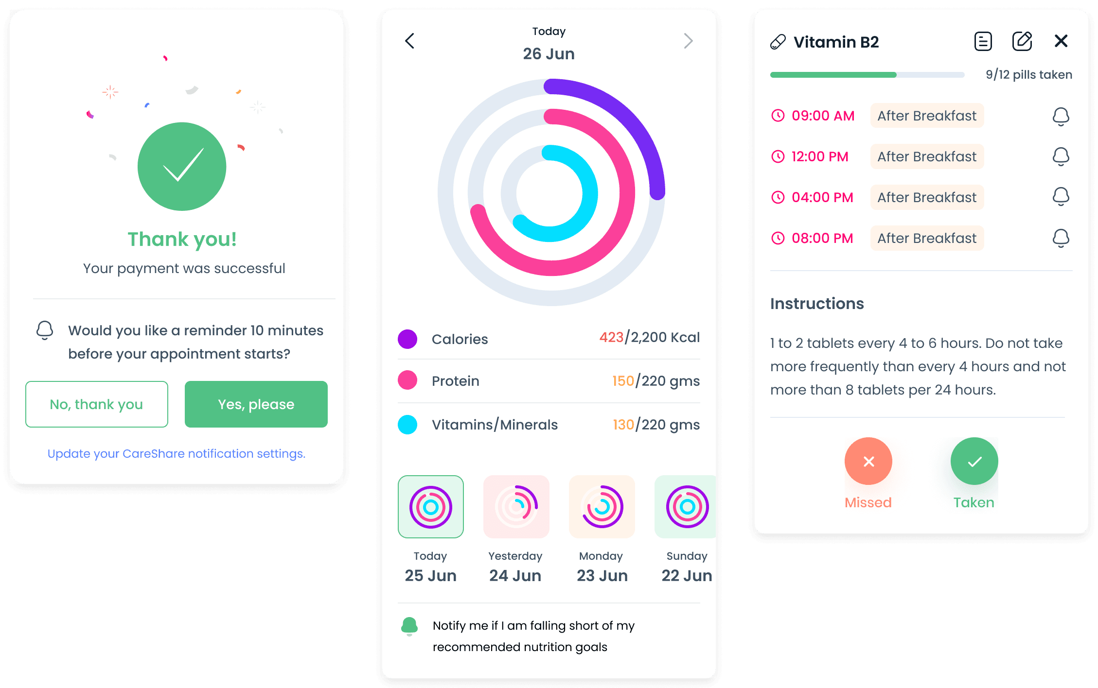
Screen 6
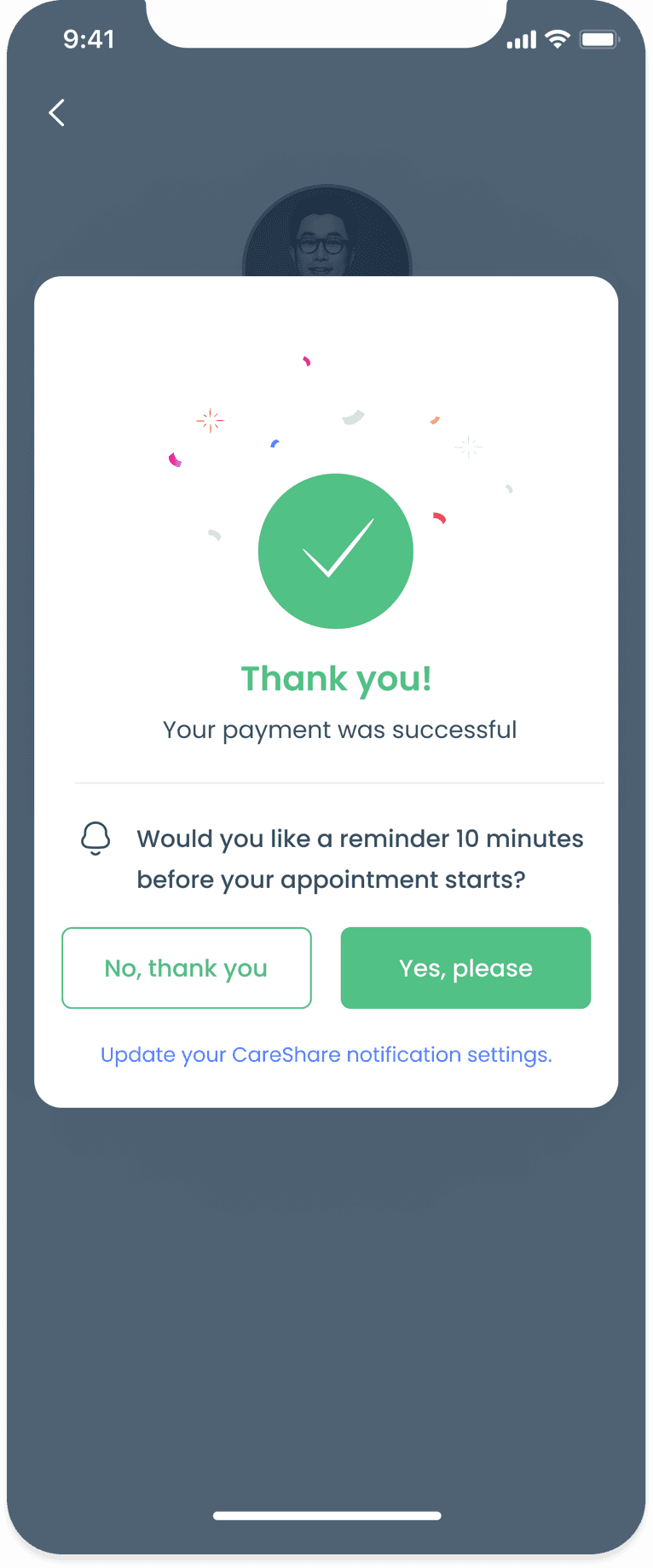
Successful transaction page, along with options to set reminders for the appointment
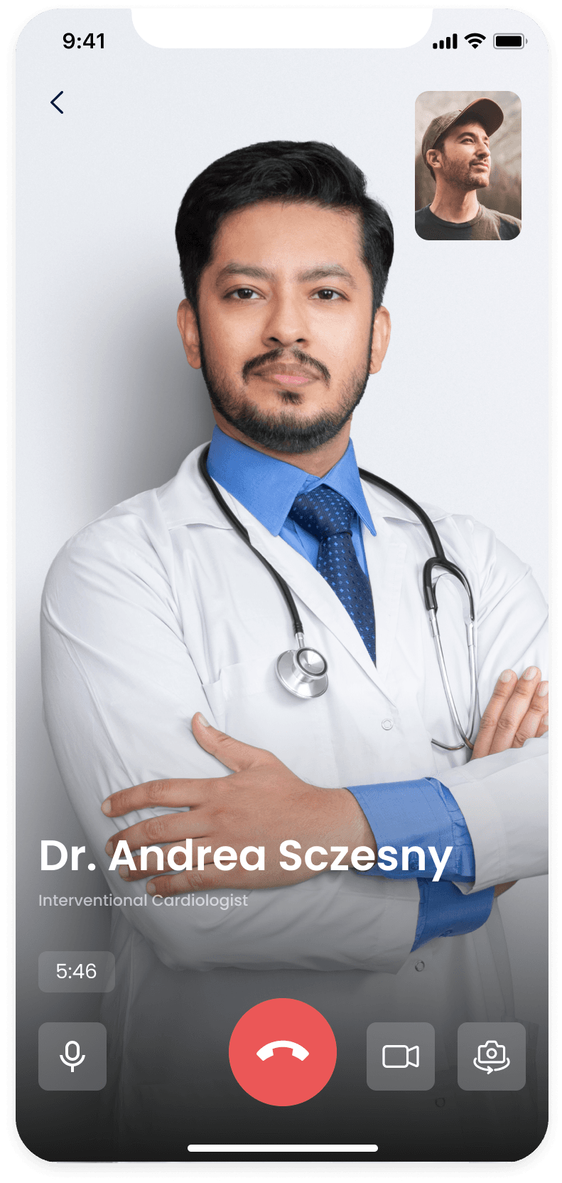
Video consultation
We used the waiting room screen to educate users with tips on cancer treatment and recovery and to promote new CareShare features.
Since a majority of users are familiar with WhatsApp and FaceTime video chat, we designed the CareShare video chat UI to be similar to both apps in order to reduce the learning curve around using the chat UI.
Screen 1
Browse or search for a doctor to consult with
Screen 2
Failed transaction page, along with options to set reminders for the appointment
Screen 3
Successful transaction page, along with options to set reminders for the appointment
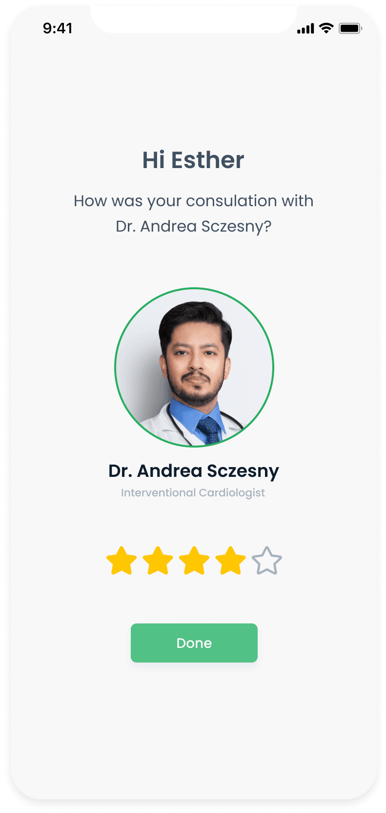
Post-consultation
Once the consultation is complete, the doctor uploads a prescription (if required). Patients can view the status of their appointment from their appointment history. When the prescription is uploaded, CareShare extracts the recommended medication and displays purchasing options.
Screen 1
Patients can view the status of their consultations from their consultation history
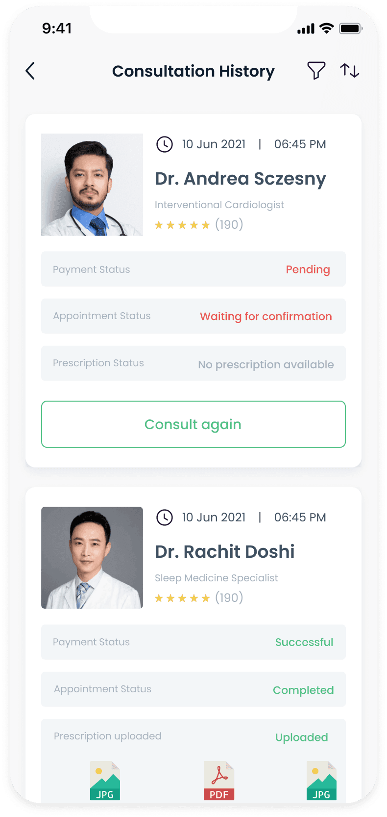
Screen 2
Doctor shares the prescriptions with the patient after the consultation is completed

Screen 3
CareShare extracts the prescribed medication and offers users purchasing options
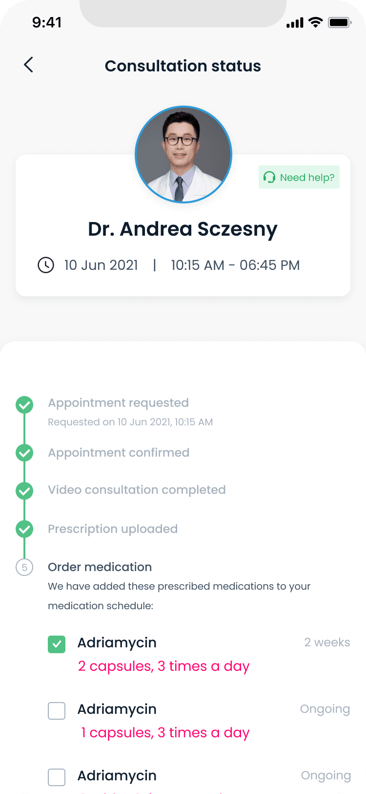
Medication tracking and adherence
We designed a medication schedule that allows users to keep track of their progress and get notified when their next dose is due. Users can also view a list of all the medicines that they have been prescribed and purchase the medication when needed. The CareShare algorithm automatically calculates the quantity of medication required based on the prescription and notifies the user when the medication is low.
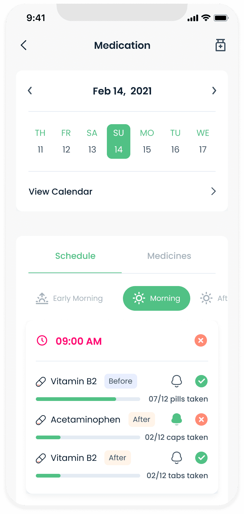
Landing screen highlights the patient's medical schedule for the current day.
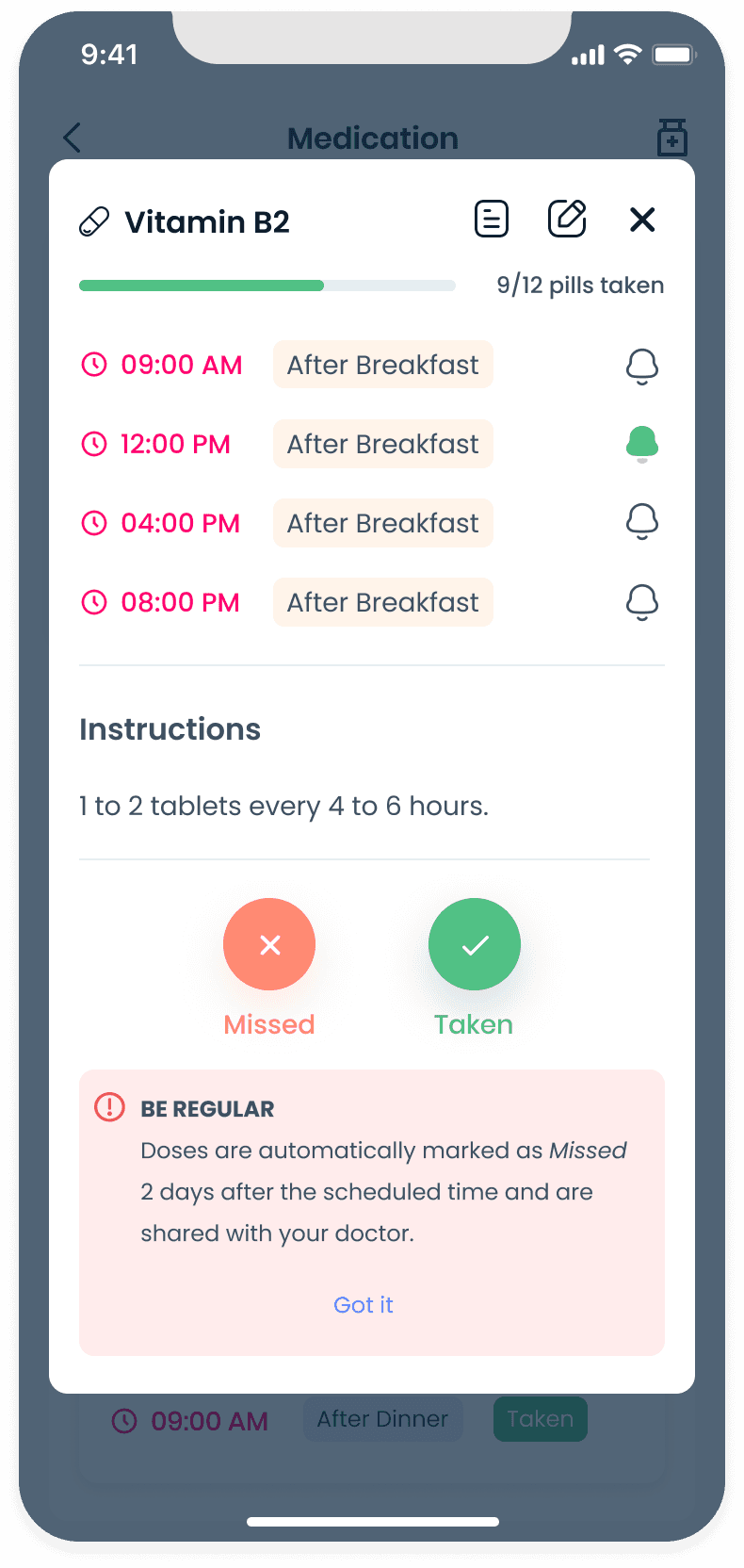
Tapping on a medicine in the schedule displays more details about the medicine in a pop-over modal.
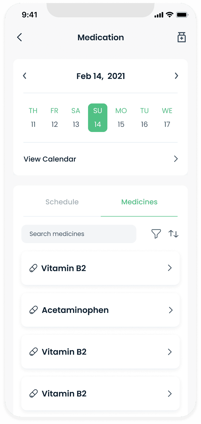
Patients browse through an ordered list of medicines. Searching, filtering and sorting is also supported.
Adding medication
Patients suffering from chronic illnesses such as cancer or diabetes usually need to take additional medication over and above those prescribed for treating their illness.
This is usually required to treat other symptoms that may or may not be related to the illness. As a result, patients and caregivers want to be able to add and keep track of their medication schedule in a single place.

Any medication added by a patient needs to be approved by a doctor before they can be added to the medication schedule.
Screen 1
Any medication added by a patient needs to be approved by a doctor.
Screen 2
Patient selects the medicine from a per-populated list and adds the duration.
Screen 3
UI for date selection.
Screen 4
Users tap on cells in the calendar to add dosage for that particular day and time.
Screen 5
Users can use templates to quickly add doses to multiple days and times at once.
Screen 6
Selecting Daily selects all days of the week and allows users to tap a timing head to select the entire column.
Managing nutrition
Doctors and nutritionists are interested in knowing if a patient has consumed the recommended amount of calories and protein in a day.
We designed the Nutrition section to provide summary information about goals, meal plans and recipes on the landing page, while allowing users to view data trends and historical data as well.
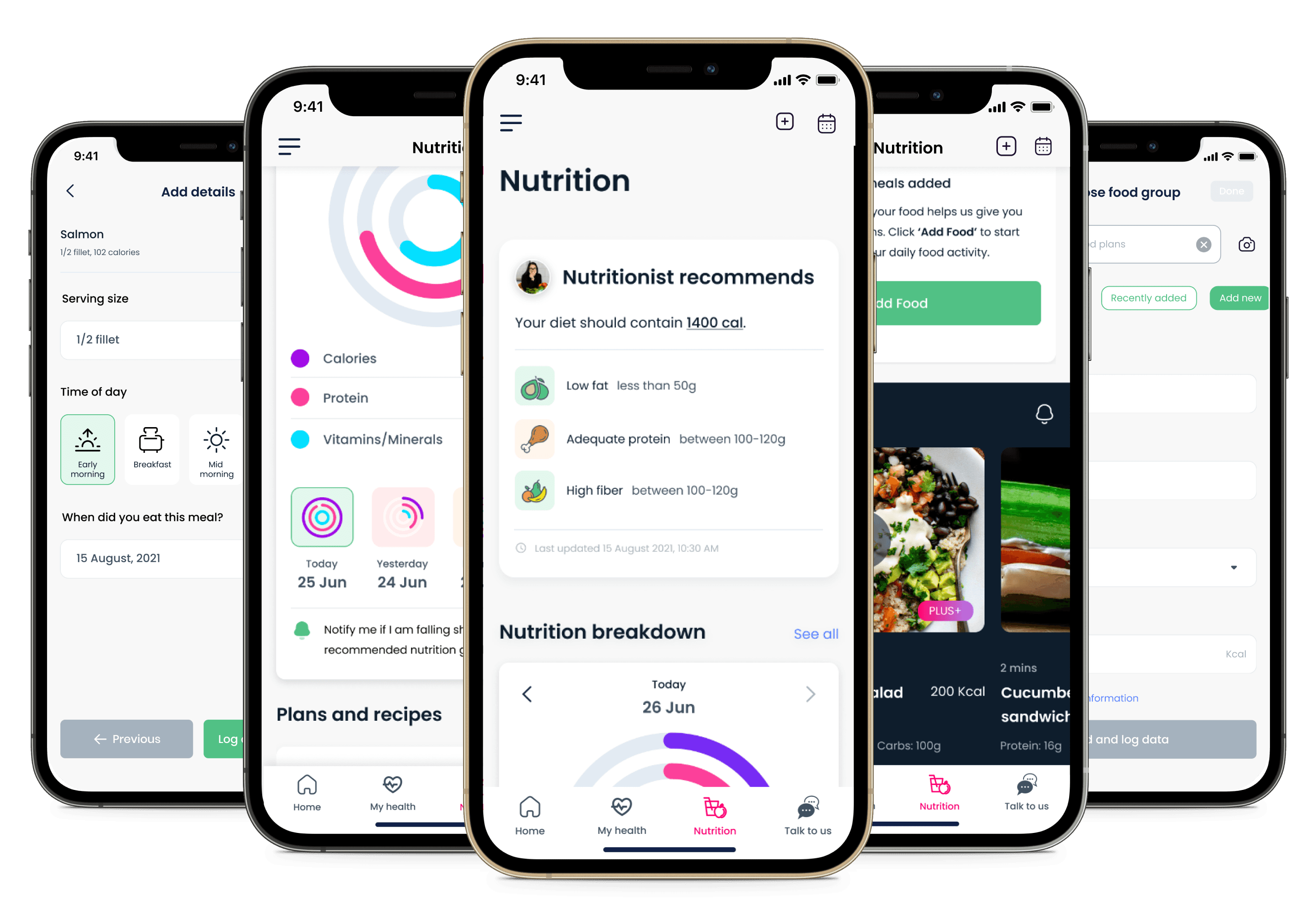
Recommended nutrition
When a patient undergoes treatment or is in recovery, and depending on the type and stage of the cancer, a nutritionist creates a meal plan specifically for the patient.
Similarly, CareShare +PLUS users see a Nutritionist recommends card that appears at the top of the Nutrition landing screen displaying a summary of their nutritional goals.

Sample of a traditional nutritional requirement summary for a patient with chronic illness
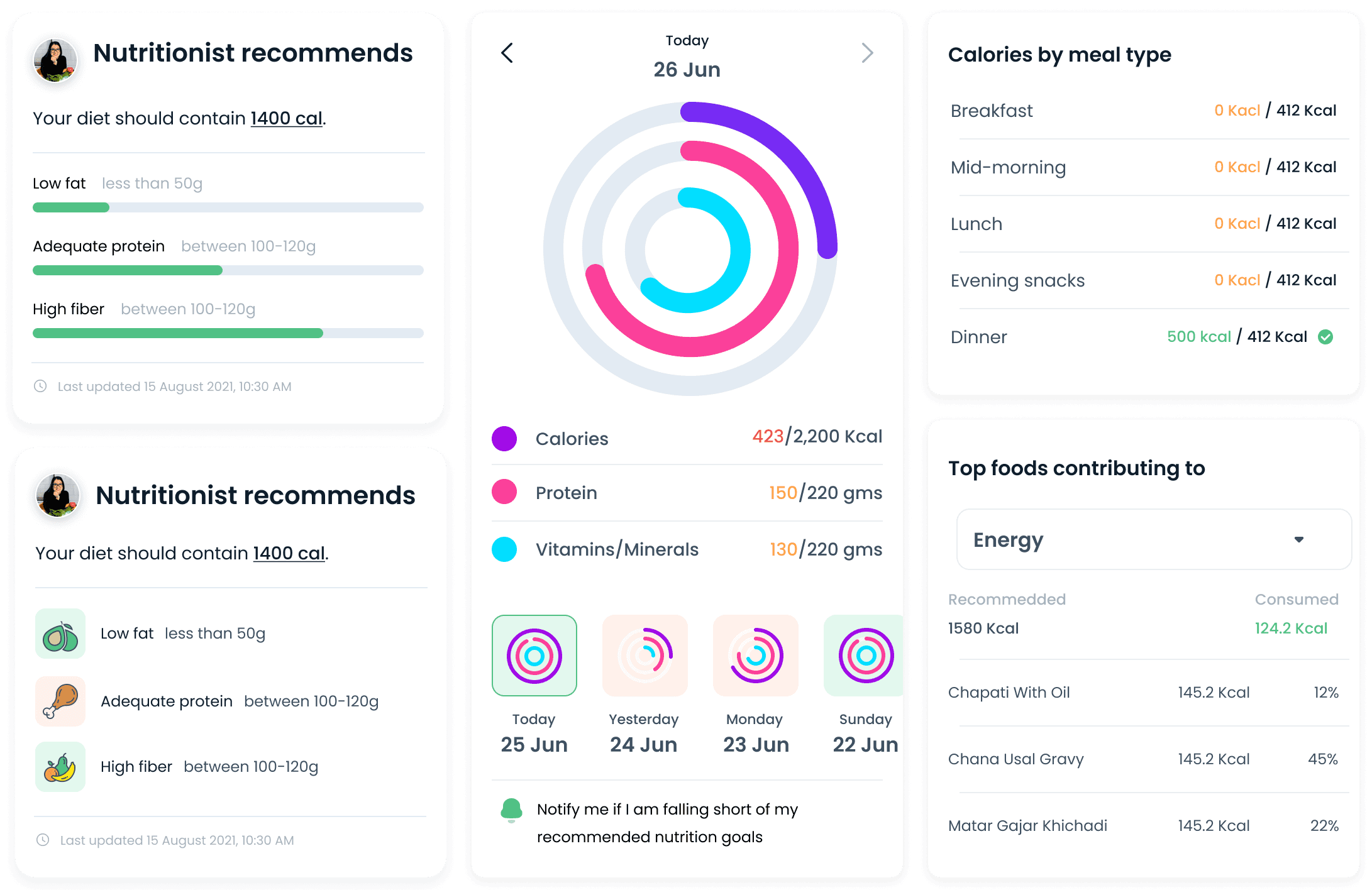
Cards that display nutritional information through different dimensions.
Custom meal plans
As part of the CARESHARE PLUS+ plan, patients get customized nutritional plans created by Zealth's in-house nutritionists based on the patient's likes, dislikes, medical history and treatment plan.

Traditional nutritional advice sheets shared with cancer patients during their treatment. The nutrition sheet provides a meal plan along with do's and don'ts.
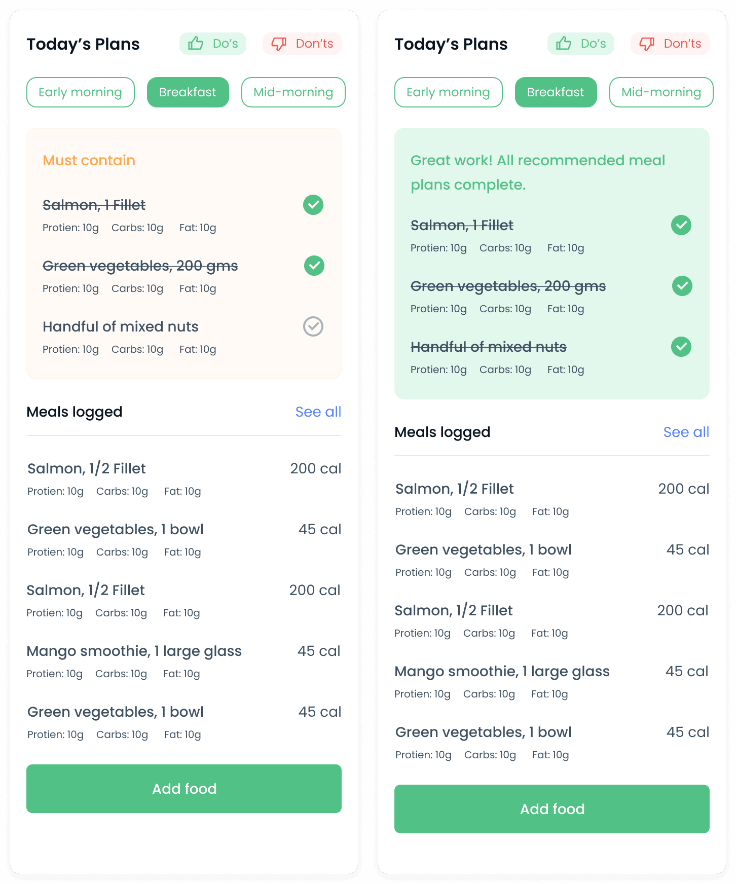
Redesigned nutritional sheet that highlights the essential foods to eat at different times of the day. Patients can also add other foods they have consumed during the day.
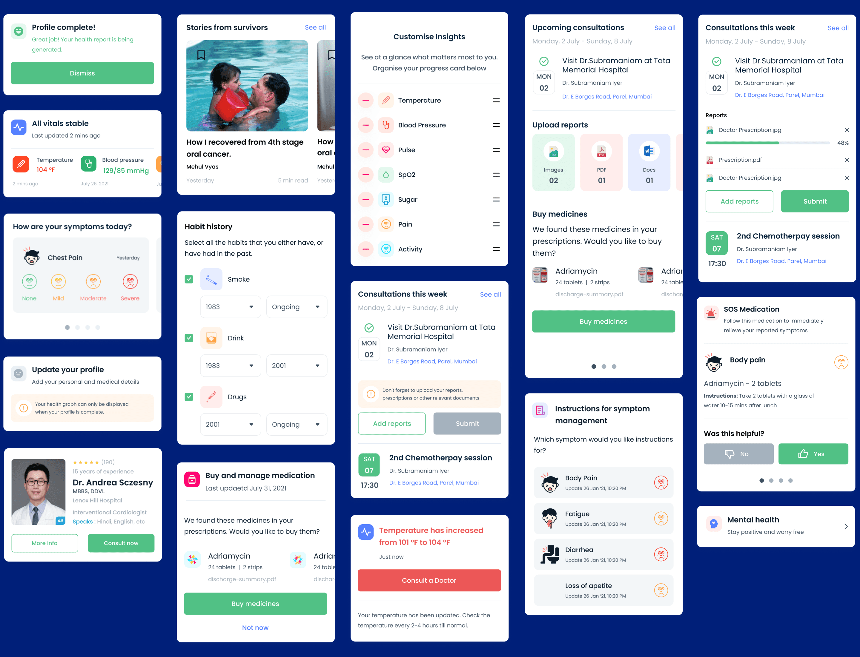
Components and cards
The design framework consists of card-based UI components that represent different states of the system. These cards are combined in different permutations to represent user journeys and experiences for different personas.
Notifications
As a real-time symptom reporting and monitoring system, push notifications are a big part of delivering timely and relevant updates to patients and doctors.
We wanted to allow users to opt-in for notifications instead of having to opt-out. I added UI affordances that allowed the user to choose to be notified when they wanted to be informed about relevant information.
Cards with calls-to-action (CTAs) to receive notifications
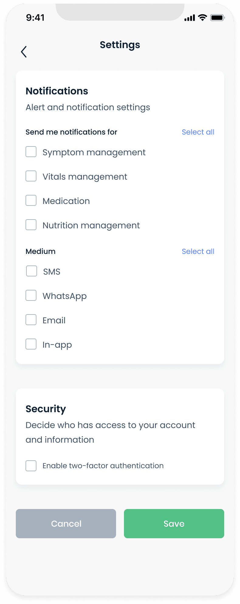
Users can customize their notification preferences from their profile settings.
Learnings
Use medically accurate scales and terminology.
In the process of trying to simplify the UX, I redesigned the official, medically approved (in India) pain scale to be more emotive and employ a shorter scale (from ten to five). However, when prototyping the new designs, doctors informed us that the new scale was incorrect and had to be similar to the traditional pain scale. Similarly, we had to replace the previously used "health score" with a "health graph" in order to avoid assigning an as yet unapproved numerical score to a patient's health.
Templates, recommendations, suggestions.
Reduce the tedium associated with filling out lengthy paper-based forms for patient history, medical history, family history, etc., that often ask for redundant information. Use visual cues to make data input less mundane, replace data entry with tap-based input. Reuse UI components to reduce data entry.
Use notifications to deliver time-sensitive information.
Users have developed "notification fatigue" and choose to either ignore or turn off notifications entirely. Notifications are most useful when they deliver the right information at the right time which results in an action that benefits the user. Add affordances in designs to allow users to choose to get notified about the results of an action.
Acknowledgements
I enjoyed working with and learned a lot from Dheeraj Mundhra and Monika Mehta and look forward to working with them again. I also want to acknowledge the great work done by Roni Biswas designing the style guide and the initial visual language around icons, graphic components and screen layouts. This gave me a good starting point from which to advance the design language.
Frankensteined in Mumbai.
Fueled by YouTube, 90s cartoons & Heavy Metal.